You are wrong if you think individuals will buy your property based on listings. Therefore when conducting marketing for your real estate, don’t focus on data and specs. Instead, come up with a unique story on what it is like to live in that particular home. You need to develop designs that will engage your audience. Otherwise, you may end up boring the entire room. You can use the display light boxes to attract the audience’s attention to your presentation.
In the recent past, there have been several researches on consumers, and the findings were that people tend to prefer text and illustration more than text alone. So if users are embracing messages accompanied by visuals, you must change the marketing strategy into visual content. This trick applies to the real estate industry, website, and other relevant marketing areas.
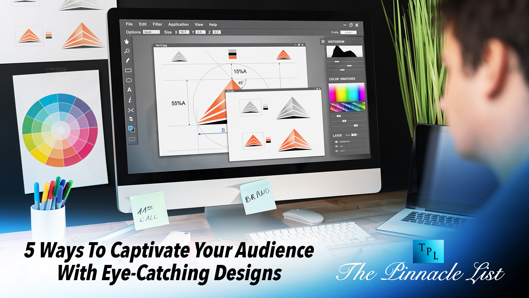
Infographics are among the more suitable ways to bring your content out into the digital and engage your audience than you could do with text alone. Now here comes the big question, how do you come up with one that is more than an ordinary image? In this post, you will read five tips for developing designs that captivate your audiences.
Start with good content
It may sound pretty obvious, but it is something that you need to focus on. If the content in your design is helpful and thoughtful, audiences will read it all. On the other hand, if you try to bring some random words together, it will translate to the final products, making the audience lose interest very early. When it comes to designs, quality is given priority over quantity. Avoid overwhelming audiences with many points when you can get it done in three to five strong points.
Break it up
You may have a ton of content or less; either way, you must break up your content into bite-sized morsels. Showing the required hierarchy in your text significantly impacts your audience. The text will enable the reader to determine the essential sections, what they can quickly scan, and the rhythm of the displayed content.
The majority of us are used to infographics as these extremely elaborate designs in which everything flows immediately into the next with no whitespace. This concept could lead your audiences to overlook important information and have zero interest in your displays. Therefore, you need to know the importance of white space; one of them is readability. It allows the users’ sight to rest simultaneously, contributing to the next hierarchy.
Consider your audience
As you develop a captivating design, you must consider your reader’s interests. The same thing you would have done with any given piece of marketing content, you will need to design with your target audience in mind. You can create an attractive design, but it will not be helpful if it doesn’t resonate with the clients. You must ask some questions to come up with something that suits your audience.
Does your audience like quick information? If so, you will need to keep it short and sweet. Use icons, bullet points, and, lastly, simple headings. By doing so, you will have everything right.
Are you targeting older audiences? No problem. All you need to do is be careful with your typesetting and ensure it is highly legible. The best way to do it is by keeping the font sizes on the larger side. Additionally, you might want to consider using contrasting colors, making it easy for them to read.
Make it simple
Avoid over-designing your infographics. Focus on making your visuals purposeful. You need to avoid it; if it doesn’t add any value to the final product, then there is no need for it to be in your infographics. Good infographics are minimalist in style and content. If you can get your audiences’ attention with less design/flourish, why not?
Develop vertical movement
Usually, a simple infographic tends to be taller than it is wide. Therefore you must guide the audience through the content. There are various subtle ways to accomplish this mission. Arrows, directed lines, diagonally divided backdrops, and backgrounds that typically overlap between two areas are some ways I would advocate for.
Final take away
Always remember that it is important to develop a visually appealing design. Ensure it aligns with the message and purpose portrayed. Getting your audience’s attention will require a long-lasting impression with good communication.