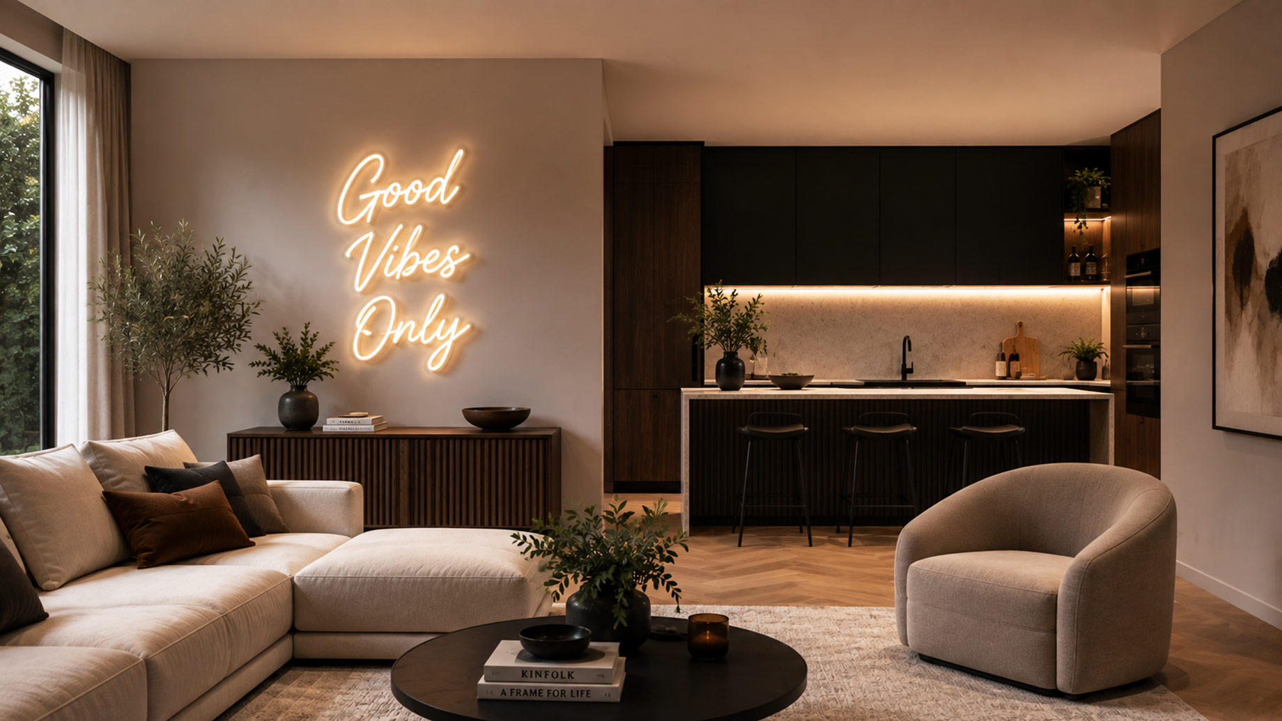
A room can be finished but not complete. The finishes are right, the lighting is layered, every piece of furniture is in its place, and yet the eye keeps wandering, with nothing to settle on. Designers have a word for what’s missing. A central point is the thing that organizes everything around it and tells you where a room begins.
A fireplace, a large canvas, or an oversized mirror once did that job. A custom neon sign just made the cut, but not as a nod to nightlife or novelty. This contemporary item is made from LED neon flex on a thin acrylic backing. It runs cool, uses very little power, and sits almost flush to the wall. It is both art and soft light.
Here are five ways designers put one to work in high-end interiors, from open-plan great rooms to quiet reading corners.
1. Make a Space Feel Personal, Not Just Designed
A perfect room doesn’t mean it doesn’t feel like a showroom floor. The difference usually lies in whether anything in it really belongs to the people who live there. Here, a custom piece does something almost no other accent can: a family name, a set of coordinates, a phrase that hits only for the household.
It’s that unique touch that’s driving more homeowners to choose custom neon signs for home decor to put their own signature on their space, rather than adopting someone else’s style. A work designed to be suspended over a headboard, mantel, or entryway console gives a lived-in specificity to a well-appointed room.
2. Anchor a Blank Feature Wall With Light Instead of Art
Every open-plan home has one wall that defies decoration. Too large for a single frame, too exposed to leave bare. A gallery arrangement can fill it, though from across a great room, the effect often reads as busy. A neon piece solves the same wall with one clean move.
It sits low and shallow, so it takes the focal position without eating the floor space a sculpture or console would, and its glow carries over as ambient light once the overheads go off. Scale is where people slip up. A sign sized for a desk looks marooned on a double-height wall, so good designers specify the piece to the architecture rather than the other way around.
3. Give an Amenity Room a Distinct Identity
Home bars, wine rooms, cinemas, and gyms usually get designed for function first and personality a distant second. That’s where a custom sign earns its keep. A word, a short phrase, or a small graphic gives the room a point of view that cabinetry and equipment never manage on their own.
Put a warm marquee-style glow in a media room, and the mood is set before the screen wakes up. In a home bar, color carries the room. Warm amber reads relaxed, a cooler blue feels sharper and more social. And dimmers matter more than the color you pick, because the same piece has to hum through a quiet dinner and then turn up for a crowd.
4. Warm Up a Minimalist Palette Without the Clutter
Minimalist and monochrome rooms photograph beautifully and can feel cold to actually live in. The usual fixes, a throw here and a potted something there, chip away at the very restraint that made the room work. A single neon element adds warmth and a note of color while leaving the negative space intact.
Restraint is the whole game. One piece, placed with intent, reads as deliberate. Three of them turn a calm room into a signage aisle. Color temperature earns a thought here, too. A soft glow in the range of 2400 to 2700 kelvin flatters neutral walls and natural materials, while a bright white or an electric hue tends to fight them.
5. Guide the Eye Through an Open Plan Space
Open layouts trade walls for flow, which is lovely right up until a space has no edges and nothing signals where the living room stops and the dining area starts. Designers use light to redraw those lines. A neon piece over a reading nook, a bar cart, or an entry claims that zone as its own without a single partition.
The eye follows brightness. A warm point of light in a corner quietly pulls people toward it and gives an open floor plan a sense of rhythm. Set it near a covered patio or an indoor-outdoor threshold, spec it weather-rated, and the same trick carries past the glass so the design reads the same inside and out.
Before mounting one, designers tend to run a quick check:
- Scale the piece to the wall and the room, never to a catalog photo.
- Hold it to one focal element per sightline so the room stays calm.
- Wire it to a dimmer so the same sign suits a quiet dinner and a full house.
- Match the color temperature to the palette, warm for neutrals and natural materials.
None of it works if the sign is an afterthought bolted on at the end. The ones that land get chosen early, sized to the wall, and built into the lighting plan next to the sconces and downlights. Handled that way, a custom neon sign stops reading as decoration and becomes the thing the whole room is arranged around. Against a chandelier or a large canvas, it’s simply one more focal point to consider, and often the one that gives a home its voice.