Choosing tiles for your bathroom, kitchen, and other spaces in your home can be exciting. You can easily get lost in the different colors of tile samples and patterns that you know will affect the look of your home. But what is usually overlooked is choosing the right grout color, which shouldn’t happen in your case. The color you choose can make or break the look you want to create. Grout colors can create various effects or just blend away.
That said, here are some tips when selecting the grout colors for your home space:
White on White
When you use white grout on white tiles, this makes the lines between the tiles disappear, making the surface blend together. This look doesn’t draw attention to the tiles in the space. This look is perfect if you don’t want to make the tiles a feature and that you want the onlooker to look somewhere else. The look also creates a feeling that the room is spacious by avoiding visual breaks that shrink the perception of space. This is a great way to create an illusion of space in a small kitchen. However, also note that white grout may need regular maintenance since it can easily show signs of discolorations and stains.
Gray Grout on White Tiles
When you add more contrast between your grout and tile, this reveals the shape of the tile more clearly and the grout also forms a pattern. Choosing lighter or darker grout color to get less or more contrast will make your tile pop out even more. A soft shade of gray grout color that’s only a few shades darker than your white tile is a great choice as it lets you highlight the tile pattern without drawing so much attention. This choice is best when the tile shape, instead of its print or color, is the primary feature.
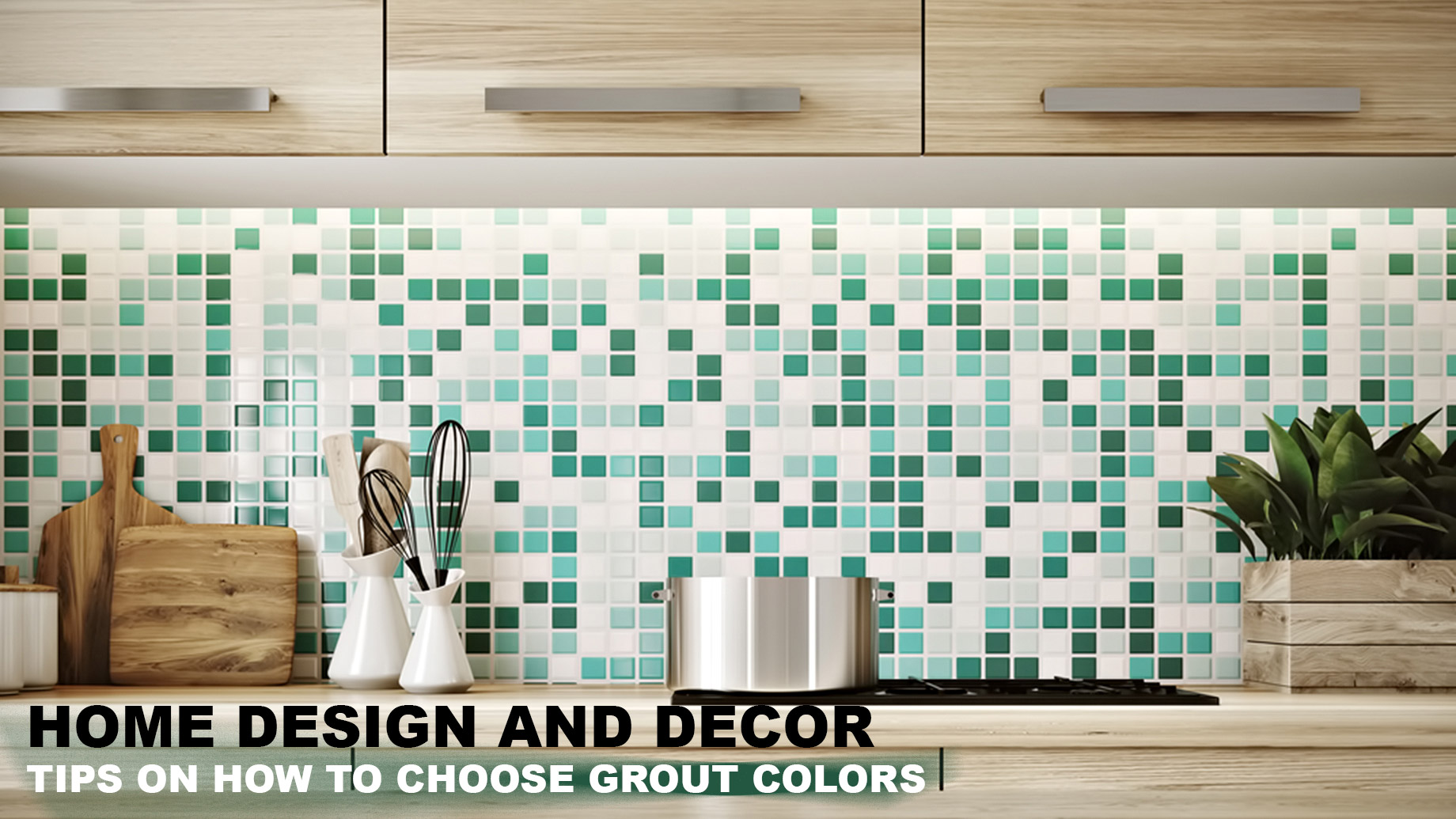
Gray Grout on Colorful Tiles
Combining a colorful tile with the correct shade of grout is trickier. Selecting a gray grout that’s as dark as the colored tile will make the grout disappear, creating an unperturbed color statement. Going darker or lighter will gently highlight the grout more and bring out the pattern, but this contrast won’t be as obvious as with the white stick and restick photo tiles.
White or Light Grout on Colorful Tiles
Using white or light-colored grout on bright colors will help tone down the color to give a space a more classic and clean feel. Pairing white with bright orange will make the color more tolerable.
Colorful Grout on Colorful Tiles
If you want to make the tiled space the main feature in a room, you can try pairing colorful grout with colorful tiles. Depending on how much you want the tiles to pop out, choose complementary or high-contrast grout for your tiles.
Other Factors to Consider
Aside from the shade and color of the tiles, there are also other factors that will affect how the appearance of the grout will turn out:
- Tile Location: Where you place the tiles will affect the grout’s appearance. Tiles on the floor aren’t as catchy as wall tiles so you can safely bring more contrast to your grout. Generally, the floor tiles are an excellent location for bringing contrast to help anchor the space.
- Grout Thickness: The size of the grout is also an important thing to consider, as it can make your grout disappear or stand out depending on how wide or narrow the tile spacing is.
- Tile Finish: Glossy or shiny tiles naturally capture highlights and usually appear lighter on the wall than they do when in your hand. For glossy tiles, choose a lighter shade of grout than you may otherwise pick.
- Multiple-Patterned Tiles: Some bathroom floors and walls come in different tile patterns. If this is the case in your space, the best thing to do is to choose a grout shade that will harmoniously blend with the patterns and colors. This might mean choosing a light shade for your grout, but you’d want to look at how the tiles go together to ensure that the shade will work for both patterns. Your safest bet would be to work with a classic gray grout to blend the patterns. If you can’t find a grout color that will blend with the tiles, you might want to rethink your tile pairing.
- Multi-Colored Tiles. Find a single color or shade in your tile set to match; you’d want to choose the most neutral one. This is the simplest way to coordinate your grout color with your tiles. Another option is to choose a shade that’s dark or light enough to contrast all the tiles. This is best done when the tile colors don’t have extremely dark or light tones.
Final Thoughts
Grout is more than the material that fills tile spaces. It’s also a vital part of your space’s overall design. Don’t make the mistake of choosing your grout colors at the last minute. Instead, take the time to weigh your options to know what will work best for your project.