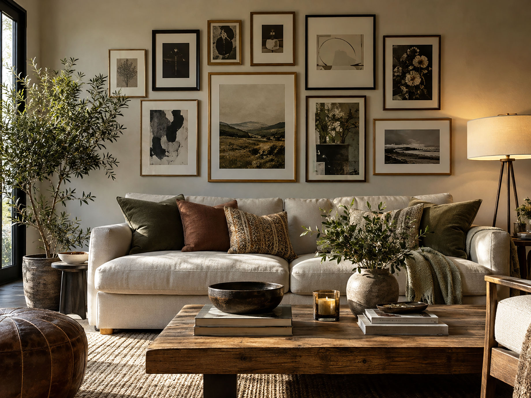
A room feels organized when its artwork shares a clear visual relationship with the furniture, finishes, and architecture. Gallery walls create that relationship through repeated shapes, spacing, and materials. The frames around each piece matter because they connect separate images into one composition without making every piece identical. Good framing also guides the eye across the wall. Several practical choices determine whether the arrangement feels deliberate and balanced, beginning with frame consistency.
A layout should start with the room, not the artwork alone. Measure the wall, note nearby furniture, and identify existing finishes before choosing frame styles. This makes gallery wall frames easier to coordinate because their color, width, and spacing can echo surrounding details. The result is a grouping that feels connected to the room rather than isolated from it.
Repeat Materials for Continuity
Repeated materials create visual links between artwork and nearby furnishings. A black frame can echo a dark lamp, while a light wood frame can relate to a pale table or floor. Repetition does not require every frame to match. A consistent finish across several pieces establishes order, while one contrasting frame introduces controlled variation. That approach keeps the wall cohesive without making the arrangement feel flat. A gallery wall groups curated arrangements by frame count, color, and room placement, giving homeowners multiple ways to decorate their home. Its layouts include options for bedrooms, corners, hallways, nooks, and stairs, with arrangements ranging from two frames to five or more. Each gallery wall also includes a life-size hanging guide, which helps transfer the planned layout onto the wall.
Match Spacing to the Room
Spacing affects cohesion as much as frame color. Tight spacing makes separate pieces read as one unit, while wider gaps create more separation between individual works. A useful starting point is to keep the gaps consistent across the grouping. Regular spacing supports cohesion and gives the arrangement a clear structure. Uneven gaps often make a gallery wall look accidental.
The outer boundary matters, too. A gallery wall should relate to nearby furniture, especially sofas, consoles, and beds. A clear center and deliberate height connect the grouping to the furniture around it.
Use Shape to Guide the Eye
Frame shape controls the rhythm of a gallery wall. Rectangular frames create a predictable structure, while varied proportions introduce movement within the grouping. A balanced arrangement usually needs one visual anchor, such as a larger photograph or a distinctive frame. Smaller pieces can support that anchor without competing for equal attention.
The relationship between portrait and horizontal orientations also matters. Alternating formats gives the eye different directions to follow, while a repeated structural pattern keeps those changes from becoming distracting.
Coordinate With Existing Decor
Artwork should connect with the room before the frame is chosen. A gallery wall near a dining area needs a different visual weight from one above a minimalist desk. Color provides one of the simplest connections. Frames can repeat a tone already present in upholstery, cabinetry, flooring, or metal hardware. The artwork should also share at least one color family with nearby decor when stronger cohesion is the goal. Texture matters in rooms with distinct materials. A fluted frame can relate to textured furniture, while a smooth frame can suit a cleaner interior with fewer surface details.
Plan the Grouping Before Hanging
A planned layout reduces guesswork and prevents unnecessary holes in the wall. Homeowners can arrange paper templates on the wall or floor first, then adjust spacing before installing the frames. The center of the grouping should relate to the room’s main sightline. In a living room, that often means centering the arrangement over the sofa rather than centering each frame separately.
Furniture scale matters too. A narrow grouping above a wide sofa can look disconnected, while an oversized arrangement can overwhelm the seating below. The final width should relate clearly to the furniture beneath it. Planning should also account for doors, windows, switches, and nearby architectural lines. Keeping the arrangement clear of those interruptions makes the grouping easier to read and maintain.
Conclusion
Visual cohesion comes from repeated decisions that connect the gallery wall with the rest of the room. Consistent materials, controlled spacing, varied frame shapes, and shared colors create that connection without making every artwork identical. The practical next step is to measure the wall and the furniture beneath it, then build the layout around those dimensions. A life-size hanging guide can simplify final placement and help preserve the intended spacing during installation.