Choosing the right colour palette for NSW homes is like solving a puzzle. Natural light changes colours in surprising ways, even for experts in interior design Australia. What looks great in a showroom might look different in your home.
It’s important to understand how light affects colour in your home. Experts at colour selection studios know that NSW’s lighting needs special colour choices. The way sunlight changes in different rooms and times of day makes colour selection both an art and a science.
This guide will help you pick colour palettes that make your home come alive. We’ll show you how to work with natural light and avoid common mistakes. You’ll learn to create spaces that feel vibrant and welcoming. Whether you’re renovating or building, getting colour choices right will change your home.
Domaine Homes has special insights into light-responsive design. Our approach helps homeowners deal with the challenges of colour selection. We make sure your interior looks perfect, morning to evening.
Understanding NSW’s Unique Natural Light Conditions
New South Wales has a unique natural light that stands out in Australia. The state’s varied landscapes create different lighting conditions. These affect how we choose colours for our homes.
Places like Sydney and the Central Coast get lots of sunlight. The light here is bright and reflects off the ocean. This means homes in these areas get 7-8 hours of direct sunlight a day, making them very bright.
The Blue Mountains have softer, more spread-out light due to their high elevation. Western NSW gets direct sunlight with less interference from the atmosphere. This means colours can look different in different parts of NSW.
To understand NSW’s light, you need to watch how sunlight affects your area. Things like where you are on the map, how close you are to water, and the terrain around you matter. When picking colours for your home, pay attention to these lighting details.
How Natural Light Affects Your Colour Choices
Colour choices in interior design are greatly influenced by natural light. Sunlight can change how paint colours look, making them more dynamic. This goes beyond just picking colours.
It’s key to understand how colours are perceived. A soft gray might look great in a bright room but dull in dimmer spaces. The undertones of colours, like beige, can shift with the light, showing pink or yellow hints.
Interior designers know that paint looks different at different times. Morning light makes colours seem sharper because it’s cooler. Afternoon light, being warmer, softens and enriches colours. So, the same wall colour can look very different at different times.
Think about the room’s direction and light when picking colours. North-facing rooms need warmer, lighter colours to feel bright. South-facing rooms can handle deeper colours without feeling dark.
To choose colours well, observe and test them. Paint samples on walls and watch how they change. Let natural light show the true colours you’ve chosen.
The Science Behind Light and Colour Interaction
Colour science opens a world where light and colour interact in amazing ways. The visible light spectrum is full of wavelengths that show us different colours. Knowing how these interact is key for picking the right paint and making rooms look great.
Light reflection is key in how colours look in different places. Each colour has a Light Reflectance Value (LRV) that shows how much light it absorbs or reflects. Designers use this to pick paints that match well with natural light.
Metamerism makes colour perception even more complex. It’s why colours can look different under different lights – like sunlight or artificial light. Painters and designers must think about these changes when choosing colours for homes.
When picking paint, look for the LRV number. Lower numbers mean darker, more light-absorbing colours. Higher numbers mean brighter, more reflective colours. In rooms with little natural light, choose higher LRV colours to make them feel brighter and bigger.
Understanding light and colour helps homeowners make better design choices. By using colour science, you can make your spaces lively and in tune with changing light.
Working With Your Colour Selection Studio
Choosing colours for your new home can be tough. Domaine Homes makes it easier with their Colour Selection Studio. Here, expert colour professionals turn colour planning into a fun and empowering journey.
Getting professional colour advice means getting help that’s just for you. Experts look at your home’s light, design, furniture, and your style. They know how to pick colours that look great in your Australian home.
The Colour Selection Studio uses cool tools to help you decide. You can see your colour choices come to life with digital tech and big colour samples. This way, you avoid bad choices and pick colours you’ll love for years.
Getting expert colour advice might seem like a splurge. But it’s worth it. It helps you pick colours that work together, saving you from costly mistakes. With Domaine Homes, you’re not just picking colours. You’re creating a home that’s truly yours.
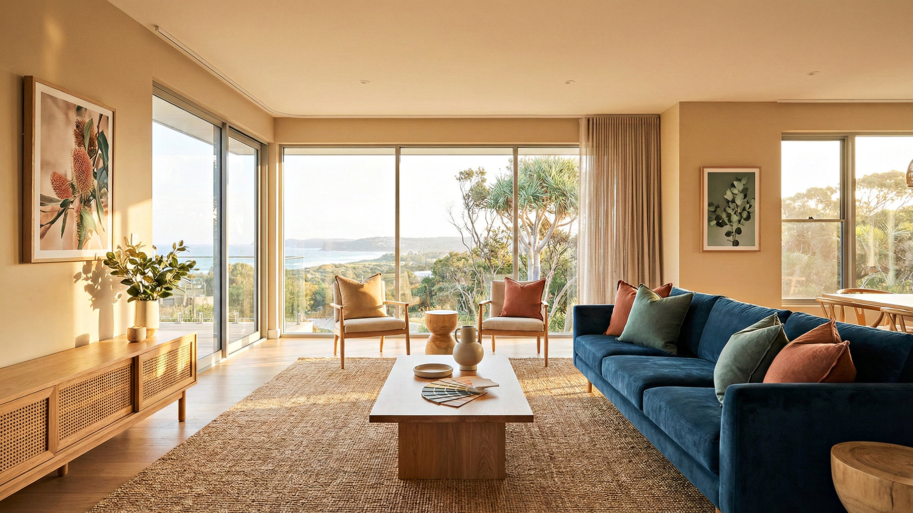
Best Colour Palettes for North-Facing Rooms
North-facing rooms in Australia get a lot of light all day. This makes them great for trying out different colours. The way the room is set up is key to picking the right colours.
Warm colours are perfect for these rooms. Think terracottas, deep blues, and forest greens. They add depth without being too much. The natural light makes each colour glow, making the room feel cozy.
If you like lighter colours, go for soft neutrals and pastels. Whites, creams, and light grays reflect the light beautifully. They make small spaces feel bigger and more welcoming.
North-facing rooms are easy to work with. You can use darker colours that might not work in other rooms. The steady light makes bold choices look good and planned.
Designing a room in a north-facing area is exciting. Use the light to your advantage and pick colours that make your space look good and feel great.
Choosing Colours for South-Facing Spaces
South-facing spaces in Australian homes face unique challenges with natural light. These areas get indirect light, making the light cooler and less bright. Choosing the right colours can make these spaces warm and welcoming.
Colour warmth is key in south-facing spaces. Warm neutrals like creamy beiges and soft taupes can counteract the cool light. These colours add warmth and brightness, making rooms feel cozy.
Designers suggest avoiding cool colours like blues and greens in these spaces. They can look dull without direct sunlight. Warm whites with yellow or peach undertones reflect light better, making rooms feel bigger and more inviting.
Light reflectance value (LRV) is important in south-facing spaces. Colours with higher LRV help make the most of the natural light. Adding artificial lighting to the right wall colours can make the room feel more comfortable and lively.
East and West-Facing Rooms: Managing Morning and Evening Light
East and west-facing rooms face unique colour challenges. Morning and evening light play a big role in how colours look. Each room’s light changes throughout the day, affecting colour appearance.
East-facing rooms get soft, warm morning light that cools down in the afternoon. Designers pick colours that match these light changes. Soft neutrals, muted greens, and balanced grays keep the look consistent all day.
West-facing rooms have a different light journey. They start with cooler light in the morning and end with golden evening light. Colours in these rooms need to handle big light changes. Warm terracotta, rich sage, and soft blues look amazing as the sun sets.
Choosing colours for these rooms means testing paint samples at different times. What looks calm in the morning might shine in the evening. Colour consultants say to watch colour samples from morning to evening to see their true colours.
Choosing the right colours can make light changes work for you. It adds depth and interest to your home’s design.
Testing Colours in Your Actual Lighting Conditions
Choosing the perfect paint colour is more than picking a swatch under store lights. It’s a critical step to ensure your room looks as you imagined. Professional designers suggest creating large test patches on your walls. This helps understand how colours perform in your unique lighting.
Begin by buying paint samples in the colours you like. Paint at least 2 feet by 2 feet test patches on different walls in the same room. This lets you see how the colour changes throughout the day.
Observe these paint samples in morning sunlight, afternoon brightness, and evening artificial lighting. This gives you a full view of the colour’s true character.
Lighting conditions greatly affect how we see colours. A warm beige might look soft and neutral in morning light but different under evening lamp glow. Take photos of your test patches at different times to compare subtle shifts. Move painted poster boards around the room to see how adjacent surfaces and fixed elements like flooring interact with your chosen colour.
The small investment in paint samples is your insurance against costly mistakes. By carefully testing colours in your actual space, you’ll be confident in your final choice. This way, you’ll create a room that looks stunning in every light.
Common Colour Selection Mistakes to Avoid in NSW Homes
Choosing colours for NSW homes can be challenging. Many homeowners make common mistakes that lead to disappointing results. Knowing these errors helps you create a stunning interior that shows off your style.
One big mistake is picking paint based on small samples under artificial store lighting. These samples don’t show how colours will look in your home. Natural light in NSW homes changes colour appearance, so it’s crucial to test carefully.
Ignoring room orientation is another paint problem. South-facing rooms need different colour strategies than north-facing ones. Not considering natural light can make colours feel flat or too much.
Following trends is another mistake. What looks great in magazines might not fit your home’s unique style. NSW homes vary, so generic trends don’t always work.
Many homeowners pick colours without thinking about how they’ll look together in different rooms. Creating a cohesive colour palette means understanding how shades work together in your space.
Getting help from professional colour consultants can prevent these mistakes. Their advice saves you from costly repainting and ensures your NSW home looks exactly as you dreamed.
Creating Cohesive Colour Flow Throughout Your Home
Creating a whole home design needs careful planning and a smart colour scheme strategy. It’s all about coordinating colours from room to room for a harmonious look. Designers say to pick a colour palette that flows smoothly from one area to another.
Start with a core group of 5-7 colours for your home. Think of these colours as a family that can be mixed and matched. Use a neutral wall colour in main areas and add accent colours to make each room unique.
Open-plan living spaces can be tricky for colour flow. It’s important to consider what you see from one room to another. Soft transitions can be made by using different shades of the same colour family or complementary colours.
Bedrooms are great for adding personal touches to your colour palette. Use your core colours as a base and add special touches that show off each room’s personality.
Don’t forget about trim and architectural details. A consistent trim colour can tie different spaces together. By choosing colours wisely, you can make your home a welcoming and harmonious place.
Domaine Homes’ Approach to Light-Responsive Design
Domaine Homes has changed the game in new home building. They make sure every home is designed to respond to light. This means colour choices are more than just pretty; they’re key to the home’s design.
At Domaine Homes, architects start with light in mind. They study how light moves through rooms and where windows should go. This way, they create spaces that are filled with natural light.
The design team works with colour experts and interior designers. Together, they make sure every choice fits a beautiful colour scheme. This teamwork ensures that homes are bright, welcoming, and perfectly balanced.
Domaine Homes knows how to build homes that look great in different light conditions. They use their experience in New South Wales to design homes that shine in any season.
Homeowners get more than just a house from Domaine Homes. They get a home where light, colour, and design come together. It’s a place where every detail is thoughtfully considered to create an exceptional living space.
Conclusion
Choosing the right colour scheme for your NSW home is more than picking pretty shades. It’s about how natural light changes spaces and making a space that shows your lifestyle. NSW homeowners can succeed by using a smart approach that looks at each room’s lighting.
The path to your dream home starts with careful watching and planning. Colour experts say to test colours in your real spaces. Notice how morning and afternoon light affects different colours. The best colours make your space feel cozy, big, and personal.
Domaine Homes advises using a Colour Selection Studio for colour choices. These experts know how light, colour, and space work together in NSW homes. They offer advice to help you avoid mistakes and get a colour scheme that flows well in your home.
Your home shows who you are, and the right colours can bring it to life. Spend time and thought on choosing colours. This way, you’ll have a space that looks great and feels truly yours. Start the journey, trust colour experts, and see your home become a bright, welcoming place.