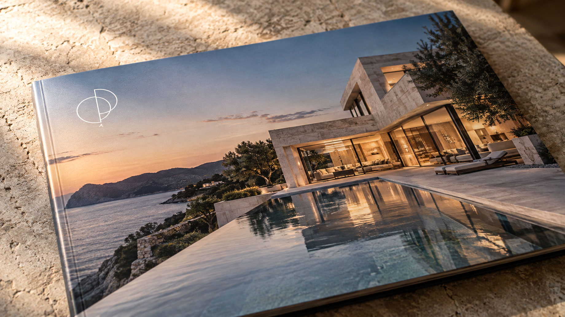
A transparent logo lets a brokerage or property brand appear over photographs, colored backgrounds, and video without an unwanted rectangular backdrop. In luxury real estate marketing, that flexibility helps create consistent materials while keeping attention on the architecture, interiors, and setting that make a home distinctive.
The benefit depends on preparation and placement. Removing a background is only one step; the finished mark must remain accurate, readable, and appropriate for its destination.
Start With the Best Available Artwork
Before editing a logo, ask the designer or brokerage for approved brand files. An original vector version is preferable when artwork needs to scale for large applications. A small screenshot may look acceptable on a phone but reveal jagged edges when enlarged for a presentation or brochure.
If the available logo has an unwanted solid backdrop, CapCut’s remove background from logo tool can help prepare an isolated version for reuse. Compare the result with the original, checking fine lettering, narrow lines, and spaces inside individual characters.
Preserve intentional white elements within the design. A white monogram or emblem detail belongs to the artwork even when the surrounding white background needs removing.
Export for the Intended Use
For digital overlays, export a PNG with transparency enabled. JPEG does not support transparent backgrounds, so saving the isolated logo as a JPEG will lose that feature. Check the exported file against both light and dark backgrounds to spot leftover borders or missing details.
Transparency does not increase resolution. Enlarging a tiny raster logo can still produce a soft result. Keep an approved vector master for scalable artwork, and ask your printer which file format and color specifications suit the finished piece.
Retain the original file alongside clearly named exports so colleagues can find the correct version for print or screen without repeating the cleanup.
Give the Property Visual Priority
On a brochure cover or property video, place the logo where it supports the composition. Avoid covering architectural features, views, or important descriptive text. Use the brand’s specified clear space, and preview the design at the size buyers will actually see.
Contrast matters as much as transparency. A dark logo can disappear against shaded landscaping, while a white version may become unreadable over pale stone. Choose an approved alternative or reposition the mark instead of improvising new colors or adding distracting effects.
Check each listing platform’s branding rules before placing logos on property photographs. Create separate exports where different channels require different treatments.
Build Consistency Into Every Campaign
Maintain a shared folder containing approved logo variants, color references, and simple placement guidance. Apply those standards across property websites, brochures, social graphics, and presentation decks.
Before release, review the whole campaign together. Confirm that logos retain their proportions, remain legible on mobile screens, and use consistent spacing. Test video placements on several frames because changing scenery can affect visibility.
Careful logo preparation gives marketing teams a reusable asset. Combined with strong photography and thoughtful layouts, it helps every piece feel part of the same considered property presentation.