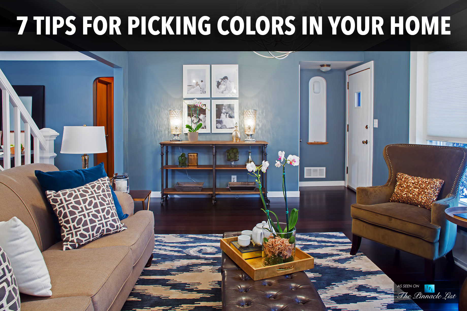
The colors you use in your home can have a dramatic impact on the way you experience your space. Choose the right shades, and you’ll enjoy a fresh sense of homecoming every time you step through the door. Personal preferences vary, but you should surround yourself with colors that make you feel comfortable. Taking a disorganized approach to your home decorating can lead to a discordant feel, while the right palette will lift your mood and brighten your day. Use these tips to get the perfect colors for your living space whether you are making home improvements or moving into a new space.
Carry Your Color Scheme Throughout
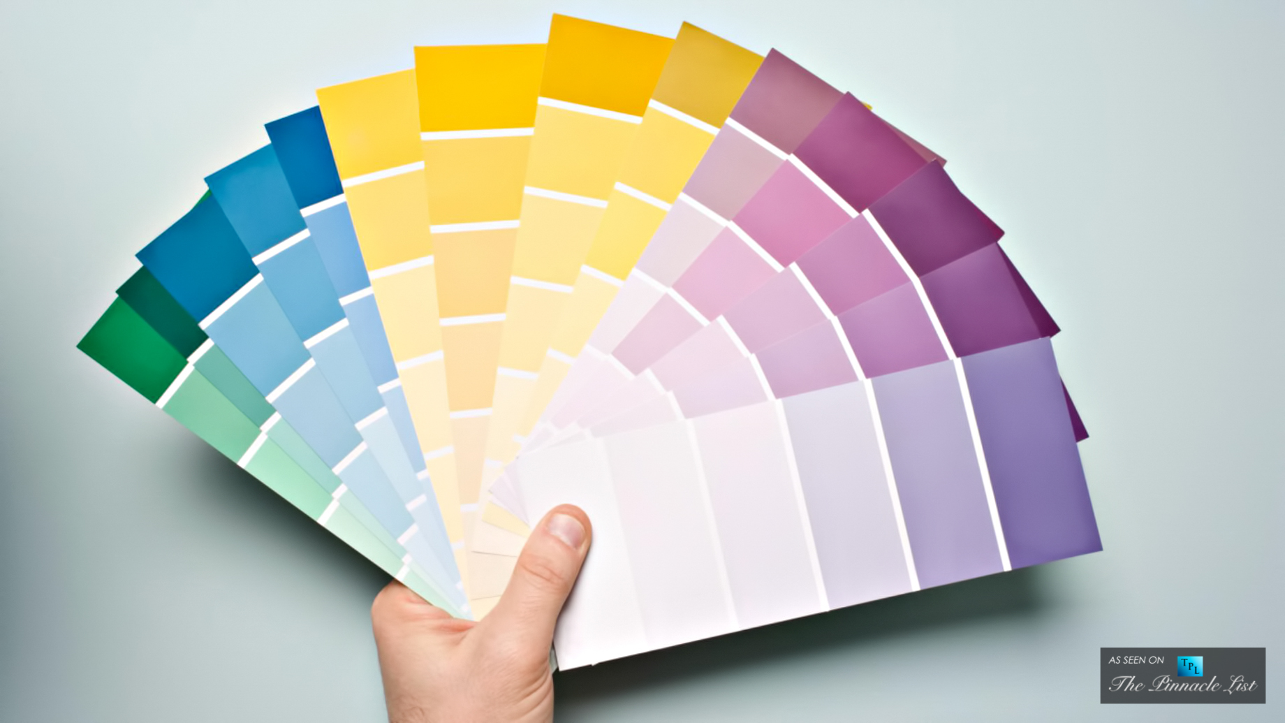
One of the best ways to create a cohesive space is to carry a single-color scheme through the home. Use the same core colors in every room, but switch up your strategies for how and where you incorporate them. Pick a palette of three to five complementary colors. You can find palette suggestions everywhere, from paint stores to Pinterest. You can also find a stunning palette in your favorite painting or a beloved piece of china.
Once you’ve chosen your colors, decide how you’ll use them in your home. You might use a soft sage for the walls in the living room, complemented by purple and blue throw pillows. In the dining room, you could put that same shade of blue on the walls and use a sage tablecloth accented with purple candles. Each room will have its own distinct look, but your home will enjoy an easy flow from room to room.
Pick the Right Pairings
There are several ways to pick complementary hues for your color scheme. Take your pick of these smart strategies, but avoid a haphazard approach.
- Pair colors that sit together on the color wheel, such as blue and green
- Create contrast with warm and cool colors, like grey and honey
- Choose accents that sit opposite each other on the color wheel, such as blue and orange or purple and green
Make sure your chosen colors work well together from the very beginning. Keep paint chips on hand as you’re shopping. This will help you find the right shade when you pick up curtains, throw blankets, upholstery, and other items.
Consider Color Psychology
Marketers use color psychology to influence shoppers’ emotions and impact their marketing decisions. These same concepts can affect how you feel in your home. Blue is associated with a cool, calm feeling that can be ideal for a restful bedroom. Yellow is a stimulating hue that invokes feelings of friendliness and optimism. Though this would be ill-suited to a space meant for sleeping, it could serve well in your active kitchen.
You should consider the cultural implications of various colors as well, particularly if you have family members with a rich heritage stemming from another country. Americans may view violet as a color for luxury and spirituality, but a grandmother from Brazil may associate it with mourning.
Pair Shades of the Same Hue
You can stretch a single hue across several home decor elements by adjusting the shade. Make one shade 50 percent lighter than your chosen color and the other 150 percent darker. This trick for creating color families is ideal for striping your walls or choosing a complementary trim color. If you already have three to five distinct colors in your palette, play with different shades rather than adding an abundance of new accent colors.
Know Your Percentages
A good rule of thumb for decorating an interior space is to use three main colors. Your dominant color should cover about 60 percent of the room. This is generally the paint on your walls. The secondary color should account for about 30 percent of the space. Use this shade in your upholstery fabrics. The accent color accounts for about 10 percent of the items in the room. Pull this hue in with throw pillows, blankets, picture frames, candle holders, and other items.
Look to Fixed Elements for Your Exterior
When you’re choosing a color for your home’s exterior, you need to consider your fixed elements first. What color are the walkways and major landscape elements? If you have grey stones and a black driveway, you’ll want a cool color palette for the outside of your home. Sandy stone pathways and red brick retaining walls look best with a warm palette. If you’re not replacing your roofing, this is a fixed feature you’ll need to consider as well.
For the exterior of your home, the siding will serve as your primary color. Trim work can feature one accent color, while doors and shutters bring in another.
Don’t Forget the Details
The walls and furniture are obvious sources of color in a room, but there are many other places where you can pull in stunning shades. Consider painting your window frames to highlight the view outside. A green will emphasize natural elements outside your home, while a dark blue or black blend in with the rich night sky.
Painting the ceiling can expand the whole space when you choose a bright white. Adding a fresh coat of paint can update your space in a stunning way. Though you may think the ceiling is white, it could turn out to be a dingy grey when compared with a fresh coat of paint. If you’re updating your flooring, think dark. A light ceiling, mid-tone wall, and dark floor creates a natural feeling, as the environment outside typically features a light sky above and dark earth below. Take time to plan your colors carefully so you can decorate your home with a mindful approach that uses hues you love. Whether you’re inspired by rich jewel tones or you want to unwind with shades inspired by the beach, you can create a home you’ll love by picking the perfect palette.