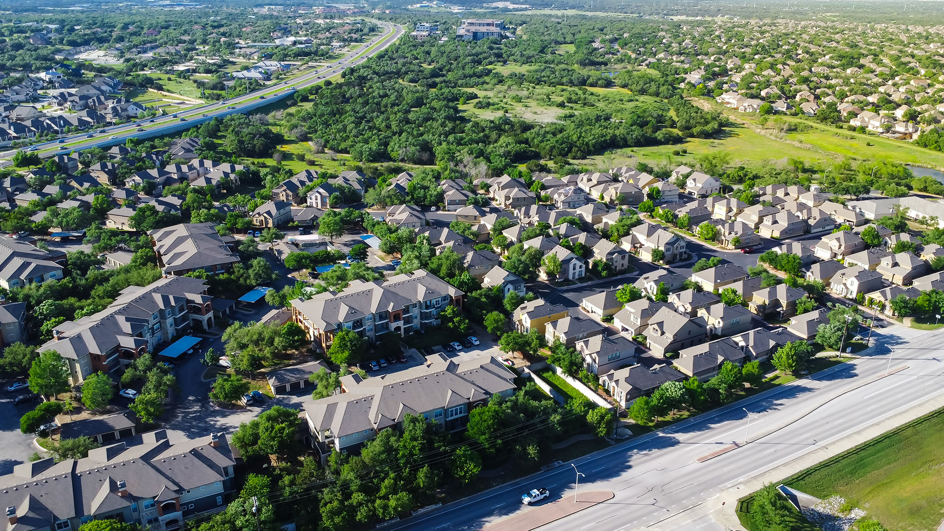
People researching a potential move often start in the same place, typing a location into a crime map and expecting the resulting colors and dots to provide a clear, reliable answer about how safe a particular area actually is to live in.
That instinct makes sense on the surface. Crime data feels objective, quantifiable, and easy to compare across different areas. But reducing something as complicated as neighborhood safety down to colored dots and rankings tends to oversimplify a genuinely more nuanced picture.
Anyone researching the safest neighborhoods in Austin quickly discovers that raw statistics only tell part of the story, and understanding the limitations of that data matters just as much as understanding the numbers themselves.
Crime Data Needs a Denominator
Raw incident counts can create a misleading impression without proper context. A neighborhood with more reported incidents isn’t necessarily more dangerous if it also has a significantly larger population, more visitors, higher density, or considerably more commercial activity happening within its boundaries.
Comparing two areas fairly requires accounting for these differences rather than simply comparing total incident numbers directly. An area with heavy foot traffic and numerous businesses will naturally generate different statistical patterns than a quiet, low-density residential neighborhood nearby.
Without that context, raw numbers alone can create a distorted impression of relative safety. Understanding what’s actually being measured, and what factors might be inflating or deflating those numbers, matters considerably before drawing any confident conclusions from the data itself.
One Block Can Tell a Different Story From the Zip Code
Neighborhood boundaries used for statistical purposes often cover considerably more ground than people initially realize. Conditions can vary significantly within a single zip code or designated neighborhood area, sometimes changing noticeably from one block to the next.
A statistic representing an entire zip code might obscure meaningful differences between a quiet residential street and a busier commercial corridor just a few blocks away. Both areas contribute to the same broader statistic, even though they might feel completely different in practice.
That variation means broad statistical boundaries don’t always reflect the specific street or block someone is actually considering. Zooming in closer, beyond general zip code statistics, often reveals a more accurate picture of conditions in a specific, targeted location.
Safety Is More Than Recorded Crime
Recorded crime represents just one piece of a much larger picture. Lighting conditions affect how safe an area feels after dark. Pedestrian infrastructure, sidewalk quality, and traffic patterns all influence how comfortable and secure walking through a neighborhood actually feels.
Visibility matters too, along with general community activity and how populated an area feels throughout the day. Emergency response access can also affect outcomes if something does happen, even in areas with relatively low reported crime statistics overall.
None of these factors show up directly in crime statistics, yet they meaningfully shape how safe a neighborhood actually feels to live in day to day. Considering them alongside crime data provides a considerably more complete picture than statistics alone ever could.
Visit the Neighborhood When You Would Actually Live There
Statistics and online research only go so far. Actually visiting a neighborhood, particularly during times that match someone’s actual lifestyle, provides insight that no dataset can fully capture on its own, regardless of how comprehensive that data might appear.
Evening visits reveal different conditions than daytime visits. Weekend activity can look completely different from weekday patterns. Walking through an area rather than simply driving past it often reveals details about atmosphere and comfort that statistics alone simply can’t communicate.
Combining this firsthand impression with multiple objective information sources, rather than relying entirely on one crime map or a single data source, tends to produce a considerably more balanced and accurate understanding of any particular area.
Conclusion
Crime statistics offer genuinely useful evidence, but they work best as one component of a broader assessment rather than serving as a definitive, standalone answer about where someone should ultimately choose to live within a given city.
Population context, block-level variation, and factors beyond recorded crime all shape how safe an area actually feels and functions in practice. None of that nuance shows up clearly on a simple colored map with dots scattered across it.
Combining data with firsthand observation and additional context ultimately produces a far more reliable picture than any single statistic or crime map could ever provide entirely on its own.