A home’s personality is not a slogan, and it is rarely a single style label that holds up under scrutiny. Walk through your space as if you were seeing it for the first time, and pay attention to what repeats. Notice the materials you gravitate toward, such as oak, linen, lacquer, stone, or steel, and how they interact with the light across the day. Consider whether your rooms feel calm and measured or spirited and eclectic, because wall art amplifies the mood that is already present. The point is not to “decorate,” but to identify the emotional temperature your home naturally carries. Once you can name that feeling with specificity, you can choose art that reinforces it rather than competes with it.
It helps to translate those observations into a small set of words that are practical, not poetic. “Quiet,” “architectural,” “playful,” “romantic,” “graphic,” “collected,” and “sunlit” are more useful than broad tags like “modern” or “classic.” Stand in the room where you expect to hang art and make a quick inventory of dominant lines and forms. Are you surrounded by hard edges, low furniture, and disciplined negative space, or do you see curves, layered textiles, and a sense of softness? Art should either echo that language or provide a controlled contrast that feels intentional. Without that framework, even beautiful pieces can read as random, like a well made sentence dropped into the wrong paragraph.
Once you understand the room’s personality, you can begin thinking like a curator rather than a shopper. Curators start with a thesis, then look for pieces that support it, and they also consider how those pieces will be produced and presented. That means deciding early whether you want original works, limited editions, photography, or curated reproductions, and whether you prefer art that arrives professionally finished. In practice, many homeowners mix sources, combining local finds with trusted online marketplaces for breadth and convenience. The most important thing is that the sourcing method matches your standards for quality, materials, and ease of installation.
Let Architecture and Existing Furnishings Set the Brief
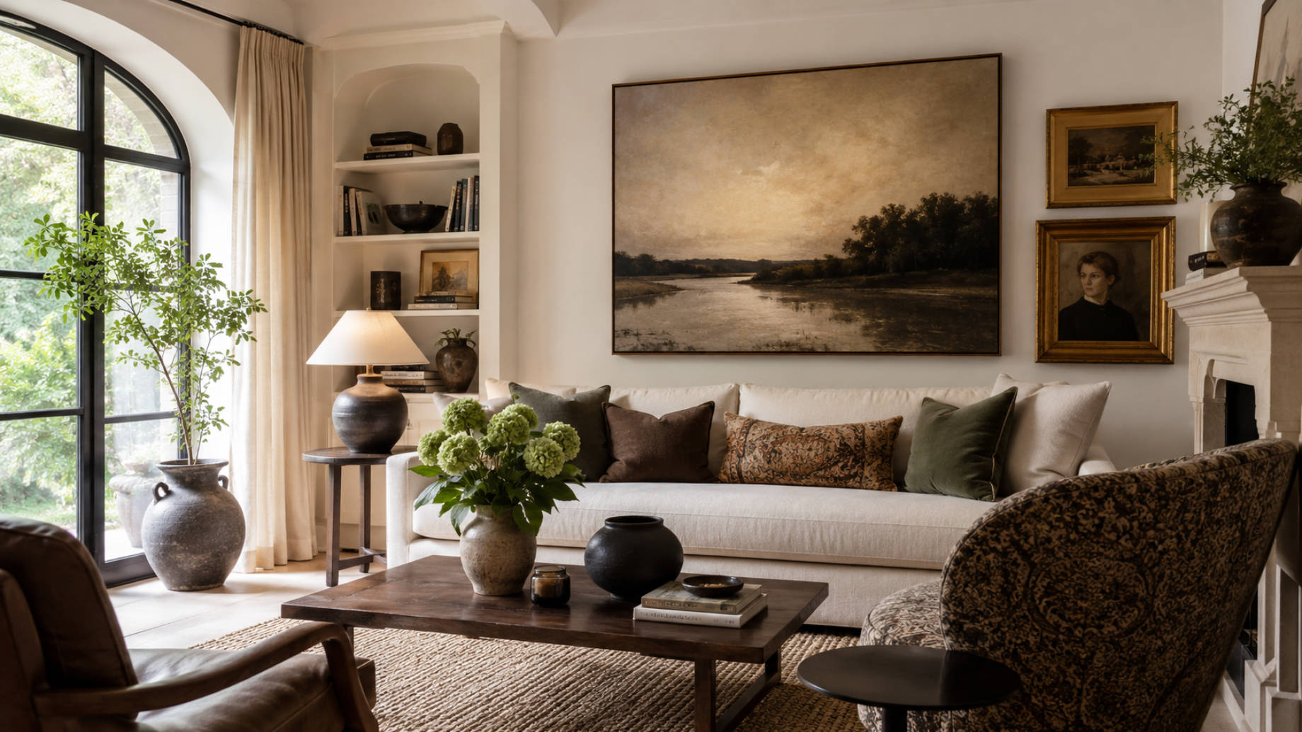
Architecture is the quiet authority in any interior, and wall art works best when it listens before it speaks. Look at ceiling height, window placement, and the rhythm of doorways and built-ins. Tall ceilings can carry vertical compositions, stacked pairs, or a generous scale that would overwhelm a lower room. A wall interrupted by windows might demand a series that accommodates breaks, while a long uninterrupted expanse can finally justify a panoramic piece. When art respects the architecture’s proportions, it feels like it belongs even when the subject matter is surprising.
Furniture provides the next set of constraints, and constraints are useful because they narrow choices. A low sofa typically wants art that is wider than it is tall, while a narrow console can take a vertical piece that pulls the eye upward. If the room already has dominant statements, such as a patterned rug, a sculptural light fixture, or a standout credenza, wall art can either harmonize or simplify. The mistake is letting every element compete for the role of protagonist. Think in terms of a cast, with one lead and several supporting players.
This is also where “ready-to-hang” becomes more than a convenience phrase, because proportion and placement often demand you move quickly from idea to execution. If you are building a gallery wall or filling a large expanse, waiting months for custom finishing can slow the whole room down. Many people solve that problem by using a mix of sources, including online marketplaces that can deliver consistent sizing and materials on a reliable timeline. When you go this route, it is worth choosing a seller that treats production quality as part of the product, not an afterthought. That approach keeps art from looking temporary, even when it is purchased digitally.
Choose a Palette That Complements Without Going Matchy
Color is the fastest way to create cohesion, and also the fastest way to make a room look overly planned. A practical approach is to identify the room’s base palette, then decide whether your art will stay inside it, extend it, or deliberately interrupt it. Staying inside the palette can produce a serene, curated effect, especially in rooms where you want visual rest. Extending it means pulling in tones that are adjacent on the color wheel or present in small doses, like a muted rust that echoes a leather book spine. Interrupting it can work when the room feels too safe and needs a focal point that reads as confident rather than chaotic.
To avoid the “matchy” trap, pay attention to temperature and saturation more than to exact color names. A room can have plenty of blue, but the difference between icy blue-gray and inky navy changes the story completely. Neutral rooms benefit from art that introduces variation, such as warm undertones in creams and sands or cool undertones in stone and charcoal. If you love a vibrant piece, consider whether your space can support that level of saturation without looking like a showroom. One reliable tactic is to let the art contain the boldest color in the room, then repeat that color only once or twice in small accents.
Pattern and texture function like color, and they often matter more in a photograph than in person. If your textiles already carry strong geometry, a piece with quiet fields of color can calm the overall impression. If your room is mostly solids, art can supply the pattern your eye is craving, whether through a botanical print, a graphic abstraction, or a collage-like composition. Texture is another lever, and it can be introduced through the medium as much as the image. Treat palette decisions as an atmosphere, not a paint chip.
Match the Medium to the Mood You Want to Live With
Medium is not a footnote, it is a design decision with emotional consequences. Canvas tends to read as relaxed and painterly, even when the image is sharp, because the surface softens light and adds warmth. Fine art paper can feel crisp and editorial, especially when paired with a thoughtful mat and a frame that respects negative space. Acrylic glass brings a modern, almost cinematic clarity that can make colors pop, though it asks you to manage glare and placement. Wood and metal introduce material presence that can echo rustic, industrial, or architectural interiors depending on how they are finished.
This is also where sourcing and production intersect with style, because the same image can look entirely different depending on how it is made. If you are choosing art online, look for platforms that are transparent about materials and that offer multiple formats so you can match the medium to the room. That matters even more if you prefer art that arrives finished and ready to install, since framing, mounting, and hardware all shape the final impression. For example, a retailer like iCanvas shows how these choices can come together in one place, with ready-to-hang wall art available in formats such as canvas, fine art paper, acrylic glass, wood, and metal. Its curated wall art selection can also help you compare subjects, sizes, and finishes before deciding what best suits your space.
Consider maintenance and longevity alongside mood, because the art you live with is the art you will notice repeatedly. In a kitchen or entryway, a surface that wipes clean may matter more than a delicate paper that demands careful handling. In a bedroom, glare can be the hidden villain that turns a calming piece into a visual irritant at night. In a sunlit room, UV exposure can quietly fade certain inks and papers over time, so placement and framing choices matter. Medium is also a way to tie together diverse imagery, because shared materiality can create unity across different subjects.
Scale and Placement: The Difference Between Gallery and Guesswork
Scale is the most common reason art feels “off,” even when the piece itself is right. People often buy art that is too small, then try to fix the problem with extra frames, extra objects, or extra distance. A better approach is to measure the wall and decide how much of it the art should occupy, especially above furniture. A common guideline is that art above a sofa or console should span a significant portion of the furniture’s width, not hover like a postage stamp. Height matters as well, and art should usually sit at an eye-friendly level rather than being pushed toward the ceiling.
Placement is also about relationships, not just location. Consider what the art faces and what faces it, because those sight lines determine how often it will be seen. A piece that looks great head-on might feel unremarkable from the angle you actually use when you enter the room. Think about how the work interacts with lighting, especially if you have recessed lights that create bright pools on the wall. If you are building a gallery wall, plan it like a layout, with consistent spacing and a clear center line, even if the frames differ. Mock-ups made with paper templates or painter’s tape are efficient and prevent unnecessary holes.
Grouping can solve scale problems, but only when it is intentional. A diptych or triptych can create rhythm and widen the visual field, while a set of small works can feel purposeful if they share a theme, palette, or framing logic. The danger is collecting mismatched pieces and calling it eclectic, which often reads as unfinished. If you want an eclectic wall, unify it with one consistent element, like frame color or mat size. Let one piece be the anchor, then choose supporting works that speak to it without mimicking it.
Subject Matter That Signals Taste Without Looking Like a Theme
Subject matter is where personality becomes legible, and it is easy to lean into clichés. Coastal scenes in a beach house can work, but they can also read like a rental if they are too literal. A better question is what kind of story you want the room to tell about you, and how subtle you want that story to be. Abstract work can communicate a modern sensibility and leave room for interpretation, while photography can bring specificity and documentary weight. Landscapes can calm a space without being sentimental if the palette is disciplined and the composition is strong.
It helps to think in categories of meaning rather than categories of décor. Do you want art that is contemplative, humorous, worldly, nostalgic, or ambitious? A single unexpected image, like a stark architectural photograph in a soft room, can create the kind of tension that makes a space feel designed. If your home’s personality is more understated, consider works with quiet complexity, such as tonal abstractions or minimal line drawings that reward closer viewing. If your home is lively, you can support figurative work, bolder color, and more overt narrative.
Avoid theme parks, even when the theme is something you genuinely love. A room full of travel posters can feel like a dorm unless it is edited and elevated with framing and scale. A wall of botanicals can look dated unless it is refreshed with contemporary composition or unexpected color. When you sense you are building a “collection,” add a piece that breaks the pattern but still belongs. That one deviation often makes the entire set look smarter.
A Cohesive Whole: Frames, Matting, and Finishing Decisions
Finishing is where many rooms either become polished or remain perpetually close-but-not-quite. Frames act like punctuation, and the wrong punctuation can change the meaning of the sentence. A thin black frame can sharpen a soft piece and make it feel modern, while a warm wood frame can humanize graphic work. Matting is equally powerful because it controls breathing room, and it can turn a small print into something with presence. Wide mats can feel editorial and calm, while narrow mats can feel energetic but also cramped if the piece is busy.
Consistency is useful, but uniformity is not always the goal. In a gallery wall, a coherent frame palette can unify diverse art, especially if the subjects vary. In a more minimal room, a single statement piece might benefit from a frame that is almost invisible, letting the image do the work. Consider the finish of nearby hardware, such as brass, chrome, or blackened steel, and decide whether the frame should echo it or intentionally differ. If you are mixing metals, do it with deliberation and repeat the mix elsewhere in the room.
Finally, give yourself permission to edit over time, because a home’s personality evolves. You may begin with one anchor piece, then add supporting works as you learn what the room wants. Rotate art seasonally if you have storage, or swap pieces between rooms to refresh the mood without buying new. Keep a few spare frames on hand, because the right frame makes it easier to say yes to a new find. The most compelling homes rarely look like they were completed in a single weekend, and that sense of gradual refinement is often the most personal detail of all.