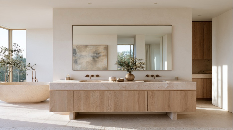
A primary bathroom can contain exceptional stone, beautifully controlled lighting, and a sculptural tub, yet still feel unresolved.
Often, the problem is scale.
The vanity establishes one of the strongest horizontal lines in the room. Its width determines how much wall is allowed to breathe. Its mass affects whether the space feels grounded or unusually empty. Then the mirror, lighting, basin, and hardware either reinforce that structure or begin competing with it.
That makes the vanity more than cabinetry beneath a sink. In a well-resolved ensuite, it behaves like part of the architecture.
There is a practical reason to think about the room this way. Houzz’s 2025 U.S. Bathroom Trends Study found that 25% of renovating homeowners use their primary bathroom for rest and relaxation, while 24% use it for beauty and pampering routines. A room expected to support both ritual and retreat benefits from visual calm, not simply expensive finishes.
Start With Visual Weight, Not a Style Label
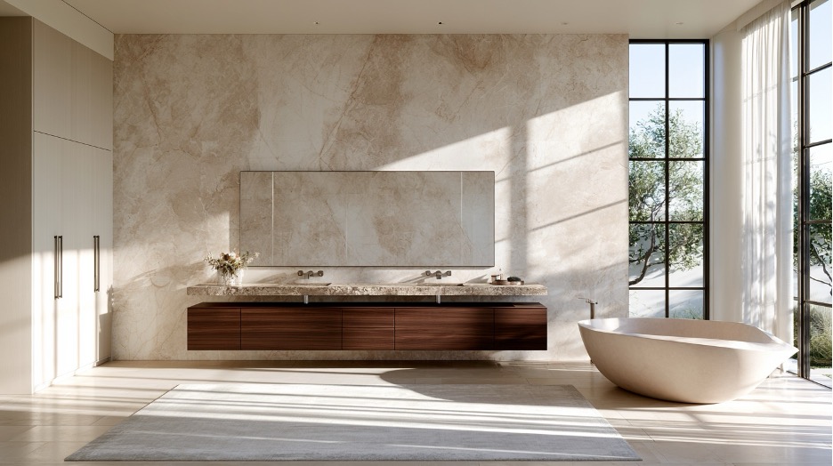
Floating vanities have become closely associated with contemporary bathrooms. Exposing more floor reduces apparent mass, and that can make a compact or heavily finished room feel lighter.
The mistake is assuming floating automatically means more sophisticated.
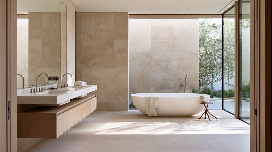
Put a narrow wall-mounted cabinet into a large ensuite with tall ceilings, broad stone surfaces, and a substantial freestanding tub, and it can look underpowered. There is visual weight everywhere else. The vanity needs enough presence to hold the wall.
A grounded vanity can do that without feeling traditional. Flat or subtly detailed fronts, a restrained plinth, and a clean countertop profile can give cabinetry a furniture-like presence while keeping the room contemporary.
This is where looking across different modern bathroom vanity styles is useful from a design standpoint. The important question is not which form looks newest. It is whether the room needs the vanity to float visually, settle the architecture, or occupy a position between those two extremes.
In my experience, that distinction is more useful than starting with a style label.
Proportion Decides Whether the Room Feels Composed
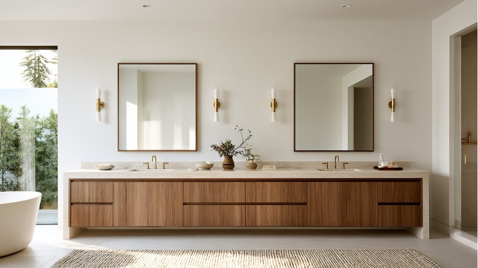
An available wall dimension is not a target.
If a vanity wall measures eight feet, filling all eight feet with cabinetry may seem efficient. It can also flatten the room by removing the negative space that gives individual elements definition.
Luxury interiors often depend on what is left open.
A few intentional inches beside a vanity can make the cabinetry feel considered rather than simply fitted. The effect becomes more important when the same wall also carries tall storage, large mirrors, sconces, or stone returns.
Double vanities deserve similar scrutiny.
Two sinks make sense when two people genuinely use the room at the same time and the layout supports both comfortably. They make less sense when the second basin consumes the stretch of counter that both users would value more.
Symmetry can be powerful, particularly in a large primary suite. But symmetry alone is not a reason to duplicate every element. One generous vanity with a broad mirror may have more architectural confidence than two smaller zones forced into perfect repetition.
Scale should answer the room.
Material Mass Changes the Cabinetry
AI photo
Materials alter how large a vanity feels before its dimensions change at all.
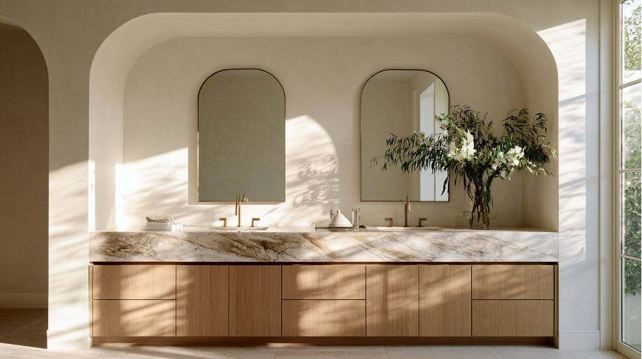
A substantial marble top can make restrained cabinetry appear heavier and more permanent. A thinner quartz profile sharpens the silhouette, especially when paired with slab fronts or a wall-mounted form.
Neither is inherently more luxurious.
Natural stone introduces variation, which is part of its appeal, along with material-specific care considerations. The Natural Stone Institute notes that sealing marble and granite countertops often makes sense depending on the stone and application.
Engineered quartz behaves differently. Caesarstone, for example, describes its quartz surfaces as nonporous and designed for relatively straightforward routine care.
Those practical differences matter. Visually, restraint matters just as much.
A strongly veined marble countertop may be exactly what a quiet oak vanity needs. Add equally dramatic wall slabs, heavily reeded fronts, contrasting hardware, bold flooring, and a sculptural vessel sink, however, and the room can become restless.
Cost does not create hierarchy. Editing does.
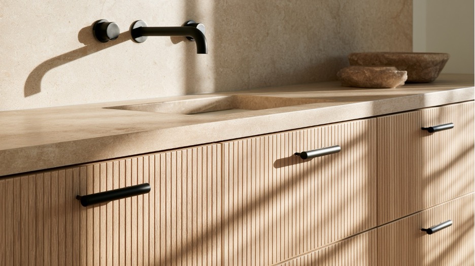
Natural oak and walnut are particularly useful when a bathroom contains large areas of pale stone because wood introduces warmth without demanding another pattern. Fluted or reeded fronts work differently. They create texture through light and shadow, which can add depth to a deliberately narrow palette.
The goal is not to make every surface memorable.
Treat the Vanity Wall as One Design
AI photo
Cabinetry occupies only part of what the eye reads.
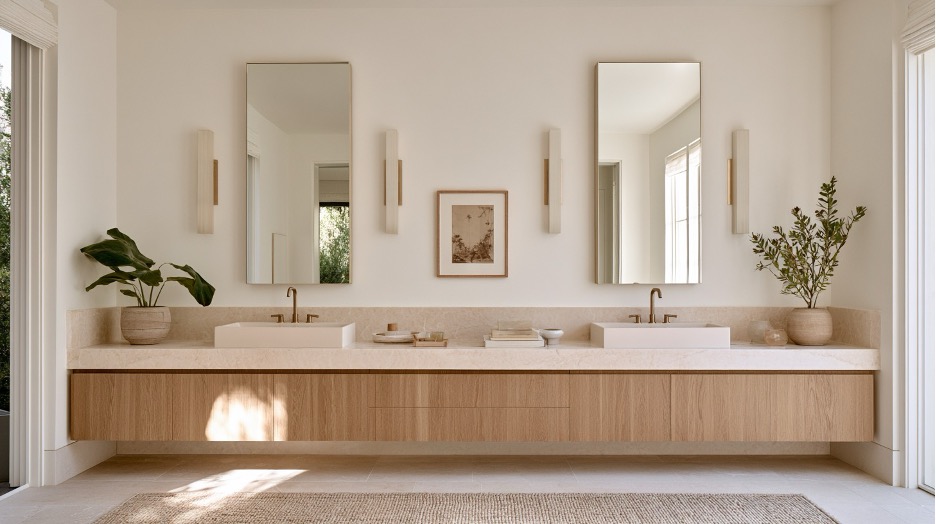
Above it, the mirror may cover as much visual territory as the vanity itself. Sconces interrupt the vertical plane. Faucets and basins add smaller shapes at close range. Hardware contributes another layer of contrast.
Selecting each piece independently is how an expensive wall begins to look fragmented.
Consider mirrors in relation to the cabinetry rather than the sinks alone. Two basins do not automatically require two identical mirrors. Separate mirrors can reinforce symmetry and create a natural place for lighting between them. A continuous mirror can strengthen the horizontal line of a long vanity and make the wall feel broader.
Neither solution is universally right.
Vessel sinks require the same discipline. Their height and sculptural shape naturally draw attention, so they tend to work better when the surrounding vanity is quiet enough to support them. An integrated basin has the opposite effect, allowing the counter plane to read with fewer interruptions.
That difference becomes useful in luxury bathrooms because not every component needs to announce itself.
Quiet Details Become Loud
AI photo
Restrained rooms amplify small decisions.
Matte black hardware against pale oak introduces a crisp graphic line. Brushed brass beside walnut, limestone, or warm marble creates a softer shift in temperature. Dark hardware on dark cabinetry can nearly disappear, allowing the cabinet form itself to take precedence.
Perfectly matching every metal is not a requirement for coherence.
Looking across broader bathroom collections from BathGems can also help clarify how vanity finishes, basins, faucets, and smaller details relate within the same room.
A brushed brass faucet can coexist with darker shower fittings when the contrast feels deliberate. Forcing every hinge, drain, pull, sconce, and accessory into exactly the same finish can make a sophisticated room feel over-coordinated.
Daily use is less forgiving.
A beautiful drawer pull that feels awkward will become irritating. A faucet with the wrong reach can create persistent splashing. A vessel basin placed on cabinetry that was never proportioned for its added height may look elegant in an elevation and feel uncomfortable every morning.
These mistakes are small on paper. They become very noticeable once the room is lived in.
Presence Has a Cost
AI photo
The vanity does not always deserve to become the focal point.
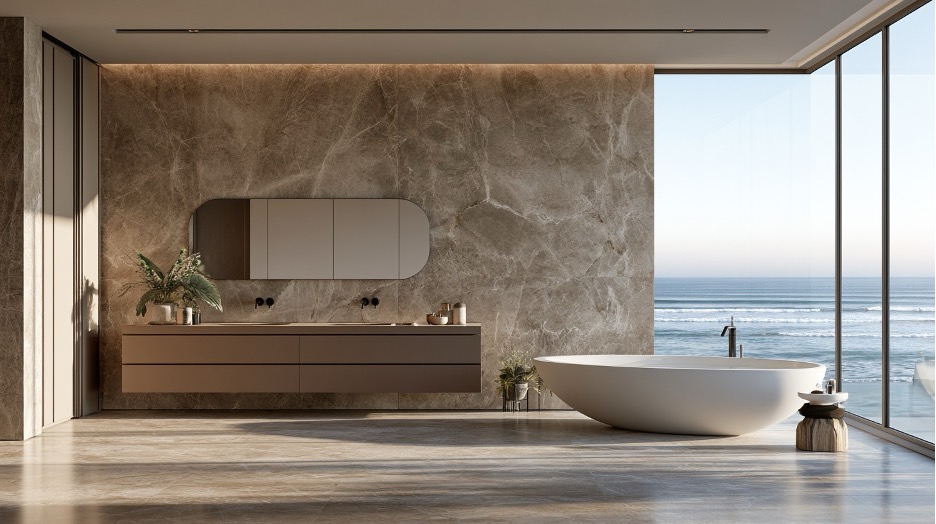
If a bathroom is organized around dramatic slab stone, an exceptional view, or a tub positioned deliberately on axis, expressive cabinetry can create unnecessary competition.
A quieter vanity may do more for the room.
The reverse is true when the architecture is restrained. Furniture-like cabinetry, expressive grain, or carefully judged fluting can provide the visual focus that an otherwise calm space needs.
This is the trade-off designers have to make. Every decision given more presence reduces the amount available to something else.
I think hierarchy is a better measure of luxury than ornament. The strongest bathrooms usually make it obvious where the eye should settle first.
Test the Room Before Choosing Another Finish
AI photo
Before approving the vanity wall, stop looking at samples for a moment.
Look at the elevation or stand at the bathroom entrance and ask:
- Where does the eye land first?
- Does the vanity have enough visual weight for its wall?
- Does the open space around it appear intentional?
- Is the countertop adding mass or reducing it?
- Do the mirrors and lighting respond to the geometry below?
- Is another feature already carrying the room?
If those answers are clear, the final material decisions become easier.
If they are not, another hardware finish or stone sample probably will not fix the underlying problem.
There is a particular confidence in a bathroom where one expensive element has been allowed to recede. It suggests that the design was judged as a room rather than assembled as a series of desirable objects. Sometimes the vanity provides the focal point. Sometimes its more important job is creating enough order that something else can.