
As an interior designer with years of experience helping homeowners in Commerce City, CO, transform their spaces, I’ve learned that choosing the right home color palette is one of the most exciting—and sometimes daunting—parts of refreshing a home. Color isn’t just about aesthetics; it shapes mood, enhances light, and even alters how a room feels spatially. Whether you’re a renter looking to add personality or a homeowner ready for a bold overhaul, this guide will walk you through finding a color scheme that feels uniquely yours, with practical tips and creative inspiration to spark confidence.
Why Color Matters in Your Home
Color is the heartbeat of a space. It can make a small room feel expansive, a dark corner cozy, or a bland layout vibrant. Understanding paint color psychology is key to creating a home that feels right for you. Warm tones like terracotta or soft yellows evoke energy and comfort, while cool hues like sage green or soft blues promote calm. The trick is balancing your personal taste with how colors interact with your home’s lighting, furniture, and function.
In my years designing interiors, I’ve seen how a thoughtfully chosen home color scheme can transform not just a room but how people live in it. A family in Commerce City once told me their dining room felt “cold” until we swapped stark white walls for a warm taupe with peachy undertones, making gatherings feel instantly more inviting. It’s moments like these that remind me why I love guiding clients through this process.
Start with Inspiration
Before diving into paint swatches, take time to gather ideas. Browse platforms like Pinterest or flip through design magazines to pinpoint what draws you in. Are you captivated by moody, dramatic tones like charcoal or navy? Or do you lean toward airy, neutral palettes with pops of color? Your inspiration doesn’t have to come from interiors—nature, fashion, or even a favorite piece of art can spark a home color scheme idea.
One of my favorite exercises is asking clients to create a mood board. Collect images, fabrics, or objects that resonate with you, and look for recurring colors. This helps translate vague ideas like “I want it to feel cozy” into a tangible palette. For example, a client once brought me a scarf with earthy greens and mustard yellows, which became the foundation for their living room’s warm, grounded vibe.
Understanding Undertones in Paint Colors
One of the biggest pitfalls in choosing paint colors for rooms is overlooking undertones. Every color has a subtle hue that leans warm (red, yellow) or cool (blue, green). A seemingly neutral beige might look pink in certain lighting if its undertone clashes with your decor. To avoid surprises, test paint color samples at home on large swatches and observe them at different times of day.
In Commerce City, where natural light can shift dramatically with the seasons, undertones are especially important. A gray with blue undertones might feel serene in a south-facing room but stark in a north-facing one. If you’re unsure, consider consulting professional color advice from a designer or painter who understands local lighting conditions.
Warm vs. Cool Paint Colors: Finding Balance
The debate between warm vs. cool paint colors often comes down to the mood you want to create. Warm colors—think corals, creams, or golds—make spaces feel intimate and energizing, perfect for social areas like kitchens or living rooms. Cool colors, like soft blues or lavenders, are calming, ideal for bedrooms or home offices.
But don’t feel locked into one camp. A cohesive home color palette often blends both. For instance, I recently worked on a home where we paired a warm greige (gray-beige) in the living room with a cool slate blue in the adjacent hallway. The contrast felt dynamic yet harmonious, thanks to shared undertones and complementary decor.
Tools to Simplify Your Color Journey
If you’re feeling overwhelmed, technology can help. A color palette generator for homes (available on sites like Canva or Coolors) lets you upload an inspiration image and instantly get a matching palette. These tools are great for experimenting with designer color palettes without committing to paint cans.
Another option is to order peel-and-stick paint samples from brands like Sherwin-Williams or Benjamin Moore. They’re low-risk and let you see how colors interact with your space. For those in Commerce City, local hardware stores often carry samples, or you can work with professional residential painters like those at Paint Coat & Seal to source high-quality paint solutions tailored to your vision (learn more here).
Matching Paint Colors to Decor
A common question I get is how to ensure paint colors complement existing furniture or decor. Start by identifying the dominant colors in your space—your sofa, rugs, or artwork. Pull one or two hues from those pieces to guide your wall color. For example, if your throw pillows have teal accents, a soft gray with blue undertones can tie the room together.
If you’re starting from scratch, choose your wall color first, then layer in decor. This gives you more flexibility to match paint colors to decor without feeling constrained. In one project, we used a rich olive green as the anchor color for a den, then brought in creams and wood tones for a natural, cohesive look.
Exploring Home Painting Color Trends
While I encourage timeless choices, staying aware of home painting color trends can add a modern edge. In 2025, we’re seeing a rise in earthy, grounded tones like clay, sage, and ochre, often paired with bold accents like deep burgundy or mustard. These colors feel fresh yet enduring, especially in Commerce City’s mix of modern and traditional homes.
That said, trends should enhance—not dictate—your palette. A trendy color only works if it resonates with you and your space. I once had a client obsessed with a vibrant emerald green trend but worried it would overwhelm their small bedroom. We compromised by using it as an accent wall, paired with soft neutrals, creating a chic yet livable space.
Creating Cohesive Home Colors
For a home that flows beautifully, aim for continuity. This doesn’t mean painting every room the same color but rather choosing a palette that carries through subtly. Pick three to five core colors and vary their intensity across rooms. For example, a soft beige in the living room might transition to a bolder caramel in the dining room, with a creamy white trim tying it all together.
Trim and ceilings are also part of the equation. Crisp white trim is classic, but don’t shy away from painting trim a soft gray or even a bold black for drama. Ceilings, often overlooked, can add depth—try a pale tint of your wall color for a subtle effect.
Testing Colors in Your Space
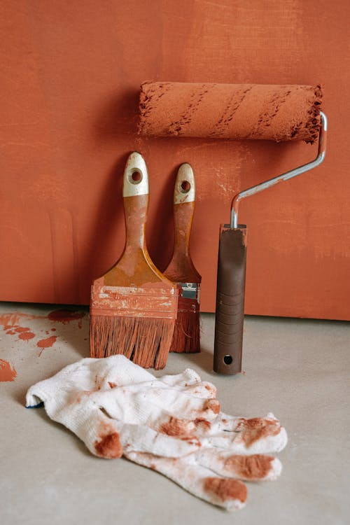
Before committing, always test colors in your home. Lighting—both natural and artificial—dramatically affects how paint looks. A color that sings in a store might fall flat under your living room’s warm bulbs. Paint large sample patches (at least 2×2 feet) on multiple walls and live with them for a few days. This helps you see how the color shifts with morning light, afternoon glow, and evening lamps.
If you’re in Commerce City and want expert guidance, consider an expert color consultation near me. Local pros can recommend best interior paint colors based on your home’s architecture and lighting, saving you time and costly mistakes.
Bringing Your Vision to Life
Once you’ve chosen your palette, the final step is execution. Prepping walls properly and using high-quality paint ensure your colors look their best. While DIY painting is tempting, hiring professionals can make a world of difference, especially for tricky spaces like high ceilings or textured walls.
In my experience, the right palette doesn’t just change a room—it changes how you feel in it. A client once described their newly painted bedroom, with its soothing lavender walls, as “like stepping into a hug.” That’s the magic of color: it’s personal, transformative, and endlessly creative.
So, grab those swatches, play with ideas, and trust your instincts. Your perfect home color palette is waiting to bring your space to life.