Choosing the right colours for your room can be an overwhelming task. The endless options of paint chips and fabric swatches often leave homeowners more confused than when they started. However, understanding colour psychology can help simplify the process and ensure you select hues that create the perfect atmosphere in each room.
Read on to unlock the captivating world of colour and how it can shape your interior spaces.
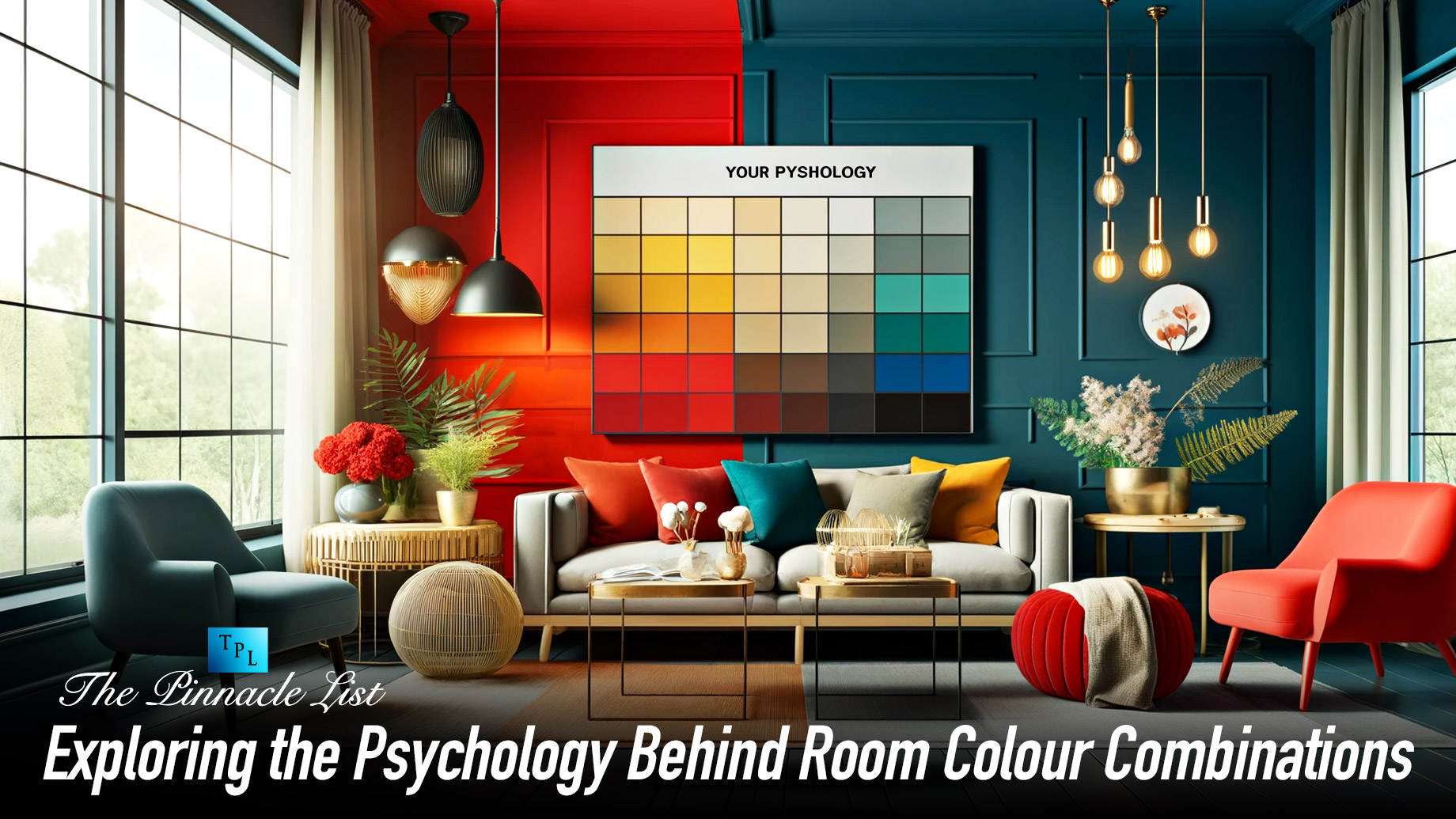
The Power of Colour in Interior Design
When designing the interior of a home, colour choice is crucial. Colours can impact our mood and behaviour in unique ways. Interior designers understand this and select colours to produce specific emotions like happiness, creativity, and relaxation. As you consider colour options for your room, it is important to take note of how each colour makes you feel.
Decoding Colour Psychology
The psychology of colour relates colours to associated emotions and meanings. While personal experiences also shape colour perception, general trends exist.
Warm red tones ignite passion and energy. Cool blue hues create a sense of calm and tranquillity. Nature-inspired greens represent growth, harmony and stability. Cheery yellow infuses happiness and positivity.
Once you understand these intrinsic associations, you can strategically employ colour to achieve the atmosphere you desire in each room.
Using Colour to Stimulate Emotion
Energising Reds
Drawing the eye, red demands attention. It increases excitement, encourages conversation and stimulates the senses – perfect for social spaces like living rooms.
Calming Blues
The sea and sky inspire shades of blue. These cool hues quiet the mind and promote relaxation, making them ideal for restful spaces like bedrooms. Light blue reads airy and refreshing, while deep azure creates profound serenity.
Balanced Greens
Associated with nature, green promotes feelings of renewal, harmony, and equilibrium. It brings the calming essence of the outdoors inside, making it fitting for lounge areas and studies.
Positive Yellows
Cheery yellow inspires optimism and infuses spaces with happiness and warmth. It energises the spirit, combats gloominess and delivers feelings of joy, making it a smart choice for entryways, dining rooms and kitchens.
Creating Cohesive Colour Schemes
Beyond understanding colour psychology, you need to learn how to combine shades into unified palettes. The options seem endless. However, there are a few foolproof approaches to harmonious colour schemes:
Analogous Colours
Analogous schemes use three or more colours located next to one another on the colour wheel, creating a sense of visual continuity.
Complementary Colours
When it comes to colour theory, complementary colours are positioned across from each other on the colour wheel, resulting in the highest possible contrast. However, when used together thoughtfully, they can create visually appealing designs.
Monochromatic Magic
Monochromatic schemes, consisting of shades, tones, and tints of a single hue, can develop a calming effect. Adding varied textures and finishes, such as glossy and matte, can add depth to the scheme.
Conclusion
With a foundational understanding of colour psychology and scheme formulation, designing a custom interior palette seems far less intimidating. Evaluate your goals for each room, consider the emotions you want the hues to evoke, and then craft a cohesive scheme. With the right application of colour, you can create interior sanctuaries as vibrant and unique as your personality.