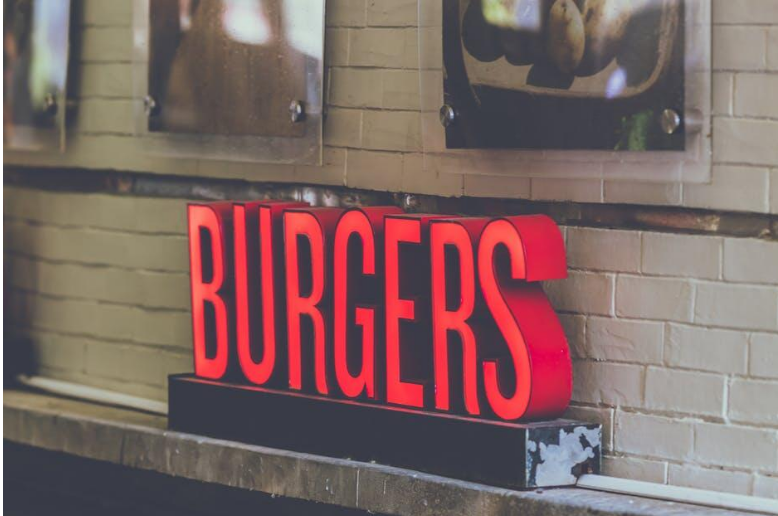
Store signs do a lot of the work for local shops. People judge your brand by what they see. A good storefront display can turn window shoppers into paying customers.
Smart visuals help brick-and-mortar stores stand out. Good design brings in more foot traffic. Strong signs make a lasting impression and help growing businesses get noticed.
Selecting Long-Lasting Sign Materials
Choosing robust building materials keeps your storefront displays looking clean for years. Outdoor displays need sturdy backing, so picking an aluminium composite board gives your shop front strong support against severe weather. Good panels stop physical signs from warping or fading under tough conditions.
Flat panels give you clean graphics without bubbles. Investing in tough materials early saves money over time. Good substrates keep your storefront looking great all year long.
Strong surfaces hold up to sun without cracking. Reliable sign bases protect your marketing investment for years. Premium panels give your logo a sharp, professional look.
Balancing Visual Elements And Space
Crowded signs confuse people who only have a few seconds to look. City design guides say to keep 30% to 40% of the sign blank. Empty space around letters helps people read the main words quickly.
Smart visual balance relies on clean structural choices:
- Clear margins around your logo
- Uncluttered text blocks
- Adequate padding between images
Leaving space around your words makes your message easier to read from far away. Simple layouts keep customers from getting distracted. Open areas guide the viewer’s eyes straight to what matters most.
Using Color Contrast For Maximum Visibility
Color choice affects whether drivers notice your store from a distance. Research shows you need a color contrast of at least 70% between text and background so people can read it easily. Good contrast stops letters from blending into the sign.
Dark text on bright yellow or white is a solid choice for store signs. That kind of contrast works well in sunlight or at dusk. The right colors draw eyes straight to your message.
Light text on a dark background works too. Avoid colors that are too similar; keep the lettering crisp. Good color combos help people read your sign faster.
Understanding Material Composition
Knowing how display panels are built helps you make better purchasing decisions. Material research highlights how composite products feature two prepared aluminum sheets surrounding a solid polyethylene core. This specialized layering delivers structural strength without adding heavy weight.
Lightweight panels allow easy installation across various building exterior surfaces. Store managers get industrial strength and keep setup simple and manageable. Strong core construction prevents bending over long periods.
Rigid panel bases stay flat even when mounted on uneven brick walls. Weather-resistant cores stop internal moisture from ruining outer printed graphics. Durable sign construction keeps maintenance costs low for storefront owners.
Creating A Lasting First Impression
A well-designed storefront sign is one of the best marketing tools a local business can have. Durable materials, clean layouts, strong color contrast, and quality construction help improve visibility and strengthen your brand.
Investing in a smart sign attracts more foot traffic, makes a professional first impression, and keeps your business looking great for years.