The color of your walls can have an impact on your home’s appearance and value.
Painting your interior every few years is part of proper maintenance. Depending on the room and activities, you’ll paint every three to seven years. For instance, kitchens have strenuous activity and require painting every four years.
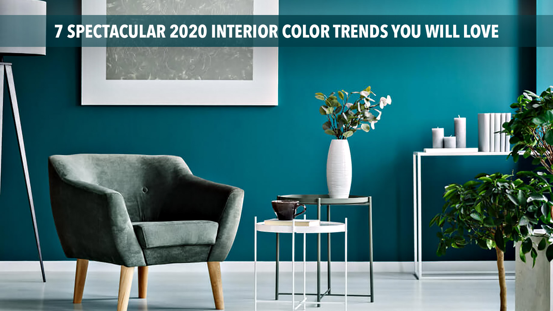
Your interior could likely use a fresh coat of paint, and you should get it done right. Keep reading to learn more about 2020 interior color trends. Here are seven spectacular ideas you must try this year.
1. Classic Blue
Patone’s Classic Blue can spark creative confidence in almost any space. It’s a shade that’s perfect for your creative space or office. You can also create a bold look in the living room or bedroom.
If you prefer a more subtle approach to this shade, consider painting accessories and furnishings Classic Blue. It’s a timeless shade you can count on remaining in style for years to come.
2. Back to Nature
Behr’s Back to Nature (S340-4) is a soothing green that brings a hint of nature indoors. This new neutral shade provides a sense of tranquility. Green’s a color of renewal, and there’s no better time to refresh your home than now.
Back to Nature hue is Earth-inspired and looks good in any room. You can use it to create a sanctuary out of your bathroom or bring a sense of calmness to a chaotic kitchen.
3. First Light
Benjamin Moore’s First Light (2102-70) is a rosy hue that brings a soft touch to any room. You can use it as an alternative to white or beige. This airy pink shade looks good with other colors
The First Light shade can benefit any space. You can paint in the bedrooms, dining room, or the kitchen.
4. Winter Calm
Valspar’s Winter Calm (4001-1B) brings a sense of calmness and beauty to your interior. It’s a soft lavender shade with a touch of grey. This color gives creamy textiles and architectural structures a delicate backdrop.
Winter Calm pairs beautifully with the tones in wood and leather. You can use it to add calmness in any room, including bedrooms.
5. Naval
Sherwin-Williams’s Naval (SW 6244) is a rich navy that creates a calm environment. Naval fuses Art Deco with the power of nature. This deep shade evokes confidence as it combines timeless color with a fresh blend of natural materials and textures.
You’ve never seen navy like this before. Consider this shade for kitchens, bedrooms, and other living spaces.
6. Chinese Porcelain
PPG paint brand’s Porcelain (1160-6) is an ink blue that conveys calmness and encourages restful sleep. Chinese Porcelain brings natural elements such as the sea and sky to your walls. It’s a blue shade that sparks hopefulness and serenity in any space.
Chinese Porcelain encourages you to enjoy peace when you’re feeling anxious and stressed. Consider this for your bedrooms and living room.
7. Pale Powder
Valspar’s Pale Powder (3001-8A) is a sandstone shade that provides a sense of calmness. With a touch of nature, it’s a colorful shade that is both livable and subtle. It creates a retreat and balance of living in your home.
Pale Powder’s a shade for a room of relaxation. Paint your living room walls with this color to achieve a bohemian style.
Combining 2020 Interior Color Trends
The 2020 interior color trends will get you one step closer to a more appealing design. You can add more flair by combining your choice with the right accents. Some tips and ideas are:
- Naval with gold metallic accents
- Chinese Porcelain with warm saffron and turmeric tones, leather accents, and dusty sand tones
- Trim should be painted white with Back to Nature
- Pair corals and blush pink with Classic Blue
You can use these color combinations and more to improve your interior. What works for someone else’s home may not be best for you. If you’re still unsure what you’re looking for, you can get samples from stores to settle on final ideas.
Avoid These Mistakes
Costly mistakes can force you to scrape off layers of paint and start over again. Make sure the paint’s chemical-free and safe. Some other common mistakes you should avoid are:
- Forgetting painter’s tape
- Not washing walls first
- Buying the wrong color
- Not buying enough paint
- Skipping primer
- Using the wrong brush
- And more
People who choose to do it yourself should use caution when painting. If you don’t know what you’re doing, it’s best to leave it to the professionals. By investing in hiring a painter, you’ll ensure the job gets done right the first time.
The Psychology of Interior Design Color
The psychology of color is the study of hues as a factor of human behavior. Color creates powerful effects, psychological and physiological. People may react differently to the same color, based on learned behavior and past experiences.
Color affects your mood and feelings. Light and cool shades give the illusion of expanded space, and dark and warm hues seemingly enclose space. Depending on the room, you can use these shades to create perfectly painted walls.
The hue of your interior can encourage feelings of boredom, calmness, stimulation, and liveliness. It can affect your reaction to sounds, taste, odors, and time perception. The psychology of color for interior design can achieve the mood you want.
Enjoy Your Dream Home
You’re one step closer to making your dream home a reality. Now that you’ve read these seven spectacular ideas, you can use what you learned here as a guide to achieving your goal. Choose your favorite of the 2020 interior color trends to get started now.
Chipping paint, inappropriate color schemes, and ideas that have gone out of style are only a few reasons why your interior may look drab. You can explore our blog longer to discover more of the best real estate and home advice. Use our website to learn more ideas to update your home today!