Designers often receive an image that looks good but does not fit the required layout. A landscape photo may be too narrow for a website banner. A product image may leave no space for a headline. A social media post may require a taller frame, while the original image has important details close to the edges.
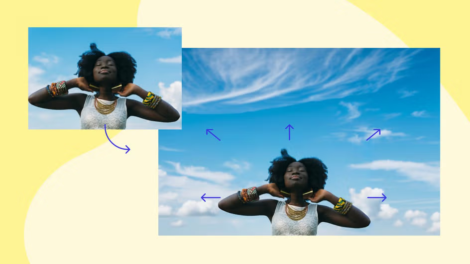
Cropping can solve some layout problems, but it may remove the subject or change the visual balance. AI image expansion provides another option. It extends the canvas and creates additional visual content around the original image, allowing designers to adapt an asset without rebuilding the entire composition.
For a quick starting point, a designer can use an ai expand image online workflow to test wider, taller, or more flexible layouts. The generated space can then be refined with normal design tools, typography, color adjustments, and brand elements.
Why Layout Flexibility Matters
The same image may be used in many places:
- website hero banners,
- email headers,
- social media posts,
- digital ads,
- presentation slides,
- blog headers,
- online store banners,
- event graphics.
Each channel uses different dimensions. An image prepared for a square post may not work in a wide header. A photo made for a mobile screen may need more horizontal space for desktop use.
A flexible image gives the design team more options. Instead of searching for a new photo every time the layout changes, they can adapt an existing asset while keeping the main subject visible.
Decide What the New Space Is For
Before expanding an image, determine why more canvas is needed. The purpose affects how much space to add and where to add it.
Common reasons include:
- creating room for a title,
- placing a logo,
- adapting a photo to a different aspect ratio,
- showing more background,
- creating a balanced crop,
- preparing multiple ad sizes,
- leaving space for a call to action.
If the extra area will contain text, choose a calm part of the image. A busy background may make the headline difficult to read. If the extra space is meant to show more environment, the generated content should continue the scene naturally.
Protect the Original Subject
The original subject should remain the visual anchor. This could be a person, product, building, food item, landscape, or event moment.
Before expanding, identify:
- the main subject,
- important edges,
- recognizable details,
- logos and labels,
- people’s faces,
- objects that must remain accurate.
Keep these elements inside the original area whenever possible. Use generated content around them rather than asking the system to recreate the subject.
This is especially important for products and people. Small changes in a face, package, or logo can make the result look unreliable.
Choose the Best Direction
The image does not always need to be expanded on every side. Adding space in one direction may produce a more natural composition.
For a website banner, the left or right side may need more room for a headline. For a vertical post, the top and bottom may need to be extended. For a centered product shot, adding equal space on both sides may help create balance.
Look at the existing visual flow. If a person is looking toward the right, additional space on the right can create breathing room. If a vehicle is moving left, extending the left side may make the image feel more natural.
Composition should guide the expansion, not just the final pixel dimensions.
Working With Simple Backgrounds
AI expansion is generally easier when the added area contains simple visual patterns. Examples include:
- clear sky,
- plain walls,
- soft gradients,
- calm water,
- grass,
- sand,
- lightly textured surfaces.
These backgrounds give the system fewer complex details to reproduce. They also provide useful space for text and graphics.
A busy city street, dense crowd, or room filled with objects may be more difficult to extend. If the new area contains many lines and repeated shapes, inspect it carefully for distortions.
Creating a Banner From a Photo
Suppose a marketing team has a horizontal travel photo, but the website design requires a wider banner. The original image may show the main landscape in the center, leaving little room for a title.
The team can extend one side of the image, create a quieter section, and place the title in that area. The main scenery remains visible, while the text gains enough space to breathe.
After expansion, compare the new side with the original. The horizon, light direction, color temperature, and texture should feel continuous. If the extension looks too detailed, simplify it with a subtle overlay or gradient.
Preparing Images for Social Media
Social platforms use several common aspect ratios. A single campaign may need square, vertical, and landscape versions.
Rather than zooming in and cutting off the subject, designers can expand the background to fit each format. This is useful for:
- fashion photos,
- food images,
- event photography,
- product launches,
- travel posts,
- creator content.
Text and interface elements may cover parts of the image, so leave safe space around important details. Review the final image inside a mock social layout when possible.
Creating Space for a Call to Action
A banner or ad often needs a clear call to action. The button or instruction should be easy to see without covering the main image.
AI expansion can create a quiet section for phrases such as:
- Learn more,
- View the collection,
- Book a visit,
- Download the guide,
- Register today.
Keep the added section consistent with the original color palette. A dramatic new background may draw attention away from the call to action or make the design feel divided.
Consistency Across a Campaign
When several images are expanded for the same campaign, use a consistent approach. The added space should have similar color, contrast, and texture across the set.
Create a simple reference:
- preferred expansion direction,
- standard aspect ratios,
- text placement,
- background treatment,
- brand colors,
- safe margins.
This helps different team members prepare assets that look related. Consistency is especially important for a campaign appearing across a website, paid ads, email, and social media.
Check People and Faces
Photos with people require careful review. AI may generate extra body parts, change a face, or create an unnatural background figure.
Avoid expanding directly through a person’s face, hands, or important clothing details. Keep the original person inside the untouched area and add space around them.
If the expansion creates new people in the background, decide whether they belong in the design. A generated stranger may distract from the message or create an unwanted impression.
For professional or personal photography, confirm that editing and publication rights are in place.
Check Products and Text
Products, packaging, and labels should remain accurate. AI-generated text inside a package or sign may become unreadable or change shape.
Do not rely on generated lettering for an important message. Add the final headline, price, date, and brand name in a design editor after the canvas is expanded.
If an existing logo sits near the edge, expand away from it or leave enough margin to avoid distortion. Inspect the result at full size before exporting.
Match Light, Shadow, and Color
The expanded area should belong to the same scene. Check:
- direction of light,
- brightness,
- shadow softness,
- color temperature,
- reflections,
- image grain,
- focus level.
A generated area that is brighter or sharper than the original can look pasted on. A subtle color adjustment can help, but strong differences may require a new expansion or manual retouching.
For photographs, preserve the original texture. For clean graphics or renders, avoid adding unnecessary grain or blur.
Use Layers After Expansion
Once the canvas is extended, bring the image into a design editor with separate layers. This allows the team to add:
- text,
- logos,
- shapes,
- gradients,
- overlays,
- buttons,
- product information.
Keep the expanded background separate from design elements whenever possible. If the layout changes later, the team can move text without editing the image again.
A soft overlay can also reduce background detail and improve readability. Use it carefully so the image still feels natural.
Review at Final Size
A large canvas can hide small problems. Always view the design at the size where audiences will see it.
Review:
- desktop banner size,
- mobile display,
- social feed preview,
- email layout,
- printed proof when relevant.
Look for repeated textures, strange objects, broken lines, and changes in focus. A detail that seems unimportant at full resolution may become obvious in a small advertisement.
Keep Version Records
Save the original image, expanded version, and final layout separately. Use clear file names and record the intended format.
For example:
- campaign-photo-original,
- campaign-photo-wide-expanded,
- campaign-photo-square-expanded,
- campaign-banner-final.
Keep notes about which areas were generated. This helps the team explain the image later and prevents a presentation asset from being mistaken for an unedited original.
When Manual Editing Is Better
AI expansion is not always the best method. Manual compositing may be better when the background contains precise architecture, repeated patterns, product packaging, or important text.
A designer may also choose a different source image if too much expansion is required. If the main subject is already close to every edge, creating a natural extension may be difficult.
Use AI when it saves time and supports the layout. Use manual work when accuracy and control are more important than speed.
A Practical Checklist
Before publishing an AI-expanded banner or layout, check:
- Is the original subject unchanged?
- Is the added space serving a clear purpose?
- Does the perspective remain believable?
- Do light and color match?
- Are people and products represented accurately?
- Is generated text removed or replaced?
- Is there enough space for the headline and call to action?
- Does the image work on mobile and desktop?
- Has the final design been viewed at display size?
- Are the original and edited versions stored separately?
Conclusion
AI image expansion gives designers a practical way to adapt photos and graphics to new banners, social posts, advertisements, and layouts. It can create extra background space, preserve a subject during cropping, and make room for titles or calls to action.
The best results come from planning the purpose of the new space, protecting important details, and checking light, perspective, texture, and scale. Generated areas should support the original image rather than compete with it.
When combined with layers, typography, and normal design review, AI expansion can make one strong image useful across many formats while keeping the campaign visually consistent.